
Challenge
Debt management is inherently complex, and many users come to Undebt.it feeling overwhelmed, anxious, and unsure of where to start. The platform needed to deliver a solution that could handle a wide range of financial scenarios—multiple debts, payoff strategies, interest rates—while remaining simple, approachable, and empowering.
The core challenge was balancing flexibility with clarity: building a system powerful enough for serious financial planning, but easy enough for everyday users to navigate without feeling intimidated. We needed to redesign the experience to guide users step-by-step through setting up their debt plans, visualizing their progress, and staying motivated over time—transforming what often feels like a stressful journey into one of empowerment and achievable milestones.
MY ROLE
Lead UX/UI designer
TEAM
4 Designers, 12 Developers, 2 UX writers, 1 Project Manager
DONE WITH
Sketch, Illustrator, ChatGPT, Relume, Lovable, Maze
INDUSTRY
FinTech

The Project
To redesign a new payment manager platform and develop a new branding system. Improve user interphase and define a hierarchy to avoid confusion and present complex data in a much digestible way. Build a design system to support, identify, and ensure consistency across all interfaces.
Research: Components & patterns
At this stage, our primary focus was to immerse ourselves in Undebt.it’s brand and product ecosystem. I began by reviewing legacy projects completed by previous teams and analyzing the existing style guide to uncover inconsistencies and identify key UX and visual design challenges.
The next step involved conducting a thorough inventory of all active products and platforms. Our goal was to map out existing components, patterns, and behaviors to better understand where alignment existed — and where it was needed.
From there, we began refining and extending elements from the current style guide, laying the foundation for a unified design system. This system would serve as the single source of truth, ensuring consistency across all future product updates and new interface designs.

Research: Diving into the platform
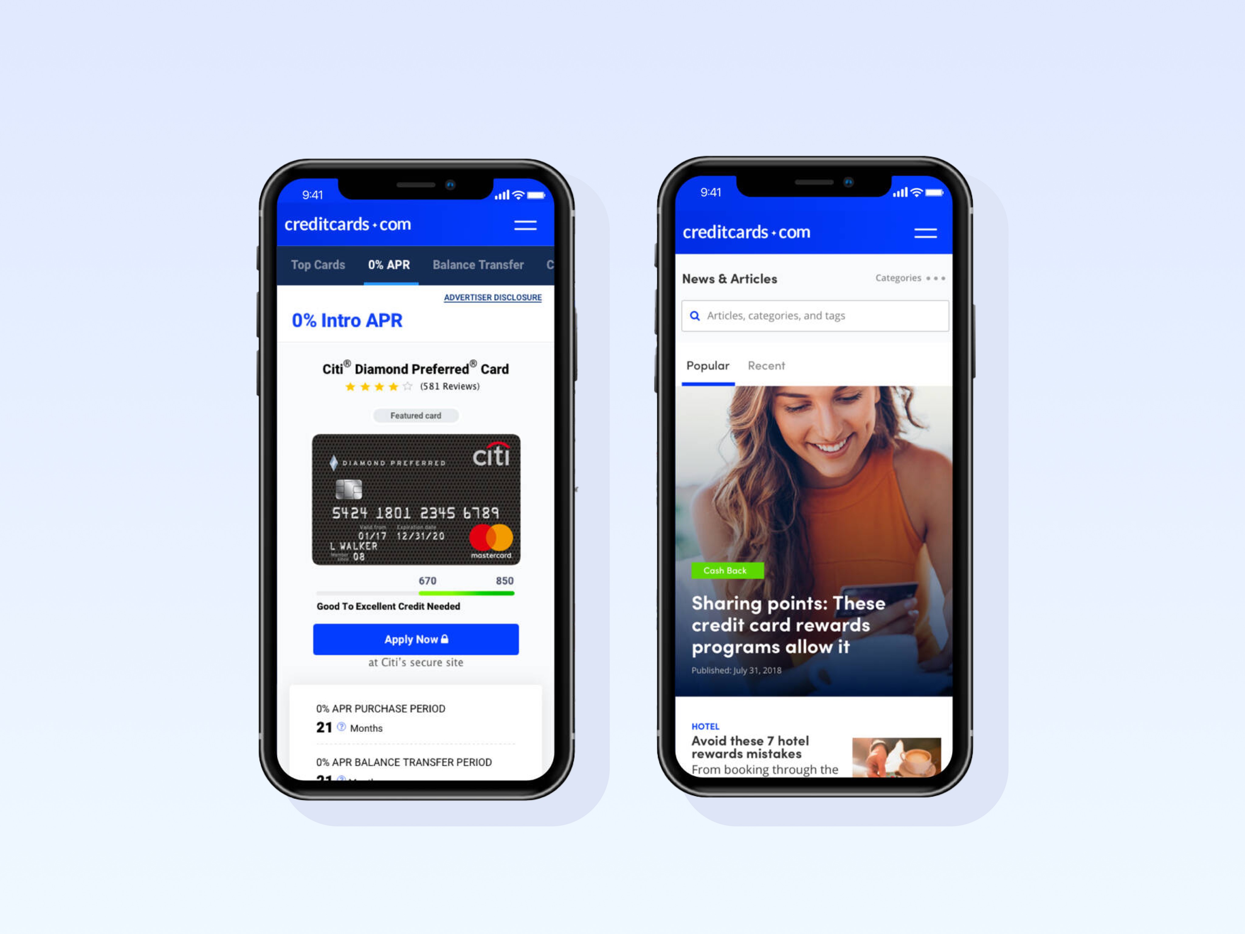
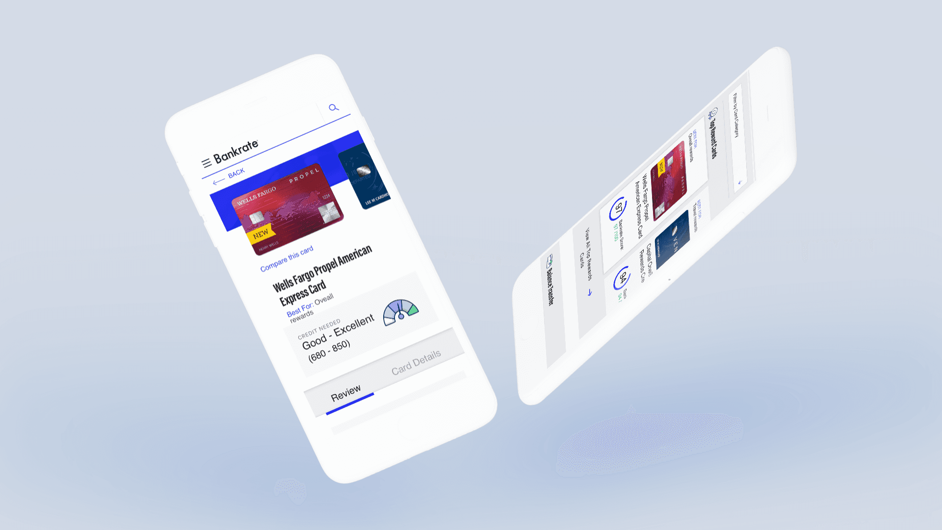
I conducted competitive research across several financial platforms to identify common patterns, features, and best practices in how they serve their users.
Key insights included:
Heavy use of graphs and charts to visualize complex financial data
Clear hierarchy to prioritize key actions and information
Customizable dashboards to fit individual user needs
Integration options that allow users to link external accounts and import bank data, enabling them to build personalized plans in just minutes
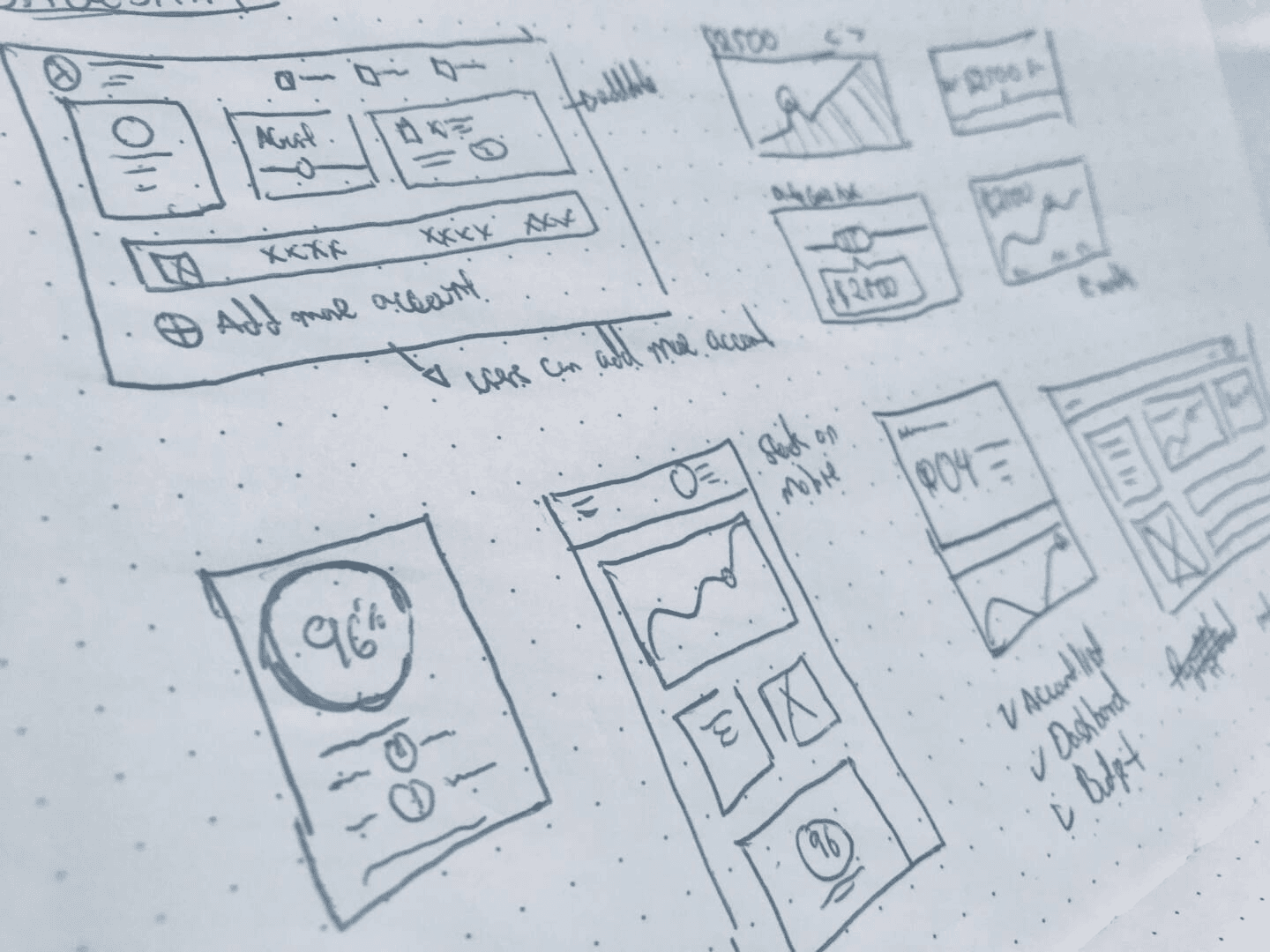
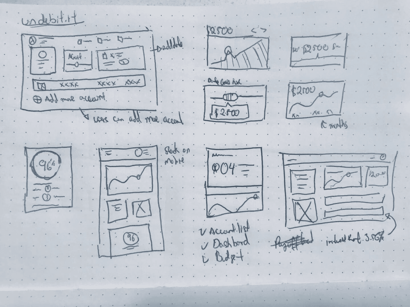
Sketches
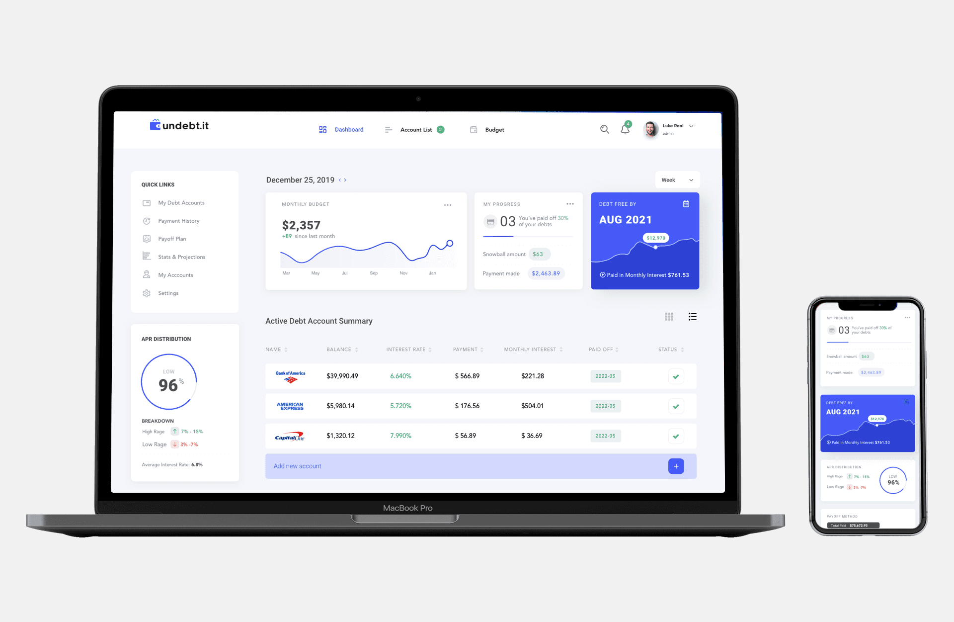
With a clear understanding of our user types and the key features we wanted to prioritize, we shifted into ideation. Given that over 70% of Undebt.it users access the platform via mobile, we adopted a mobile-first approach from the start.
We went through multiple rounds of sketching, rapidly exploring ideas and iterating based on team feedback. After refining and voting on the strongest high-level concepts, we moved into the wireframing phase—laying the foundation for a user experience that was both intuitive and tailored to real user behaviors.
User Testing: Round 1
After designing the mockups in Sketch, I used invisionapp.com to launched a small test to identify how our users react to the dashboard interphase.
Feedback
Some users were confused by the graphs we showed they didn’t understand how the chart relates to the money they are paying
Users felt good by the information presentment but felt overwhelmed by the amount of it.
I love the capability to customize their dashboard.
The majority express they felt a bit intimidated by the amount of data and complexity of the app (one of the main goals was to simplify the current experience, we need to dive deeper and figure out a better way to present data.)
Pivoting
Once I identify the user’s needs, I revisit previous work and create new mocks using Sketch. I focus heavily on simplifying the experience and redesigning the graphs to illustrate users’ progress. I then focus on trimming down information present the user – we wanted to make sure we were not removing important information instead of focusing on presenting key metrics and letting the user choose how much information they wish to look.
Interface exploration
User Testing: Round 2
Using invisionapp.com, we are validating ideas, and testing if we improved the user experience and user emotions around using the platform.
Feedback
I loved the clean interphase and the ability to customize views.
The application feels modern and professional.
Most users were able to understand the graphs and identify key metrics. The majority were able to customize their dashboard by hiding and reveal the most critical information to them.

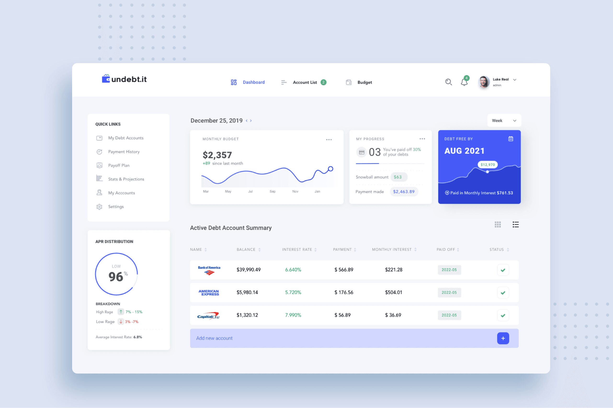
UI Design
After finding all usability mistakes through testing, I began designing the final screens in Sketch. Using the design system components we created, I started creating mobile and desktop views.
I’m a big fan of the customization feature we added to the application because it allows users to control the amount of information they wish to see at once, this allows us to create a much cleaner application without sacrificing content.

The Take Away
Focusing on simplicity, personalization, and mobile-first design was key to transforming a complex financial task into an approachable and motivating experience. By listening to real user behaviors and aligning design decisions with their needs, we were able to help users feel more confident and empowered on their journey to becoming debt-free.