

Challenge
Design an app-based solution to better track packages and notify users with on live updates of their packages journey from beginning to end.
All of us had personal experiences in this situation – we order a package, and it takes longer to arrive than anticipated, which impressed the importance of designing something practical, usable, and straightforward.
The project
Design an intuitive mobile app for tracking packages. The interphase should easily illustrate the user’s package journey from beginning to end, also, to use the on-time notification and map tracking capabilities.
MY ROLE
Freelance Designer
TEAM
1 Designers, 2 Developers, 1 founder
DONE WITH
Figma, Illustrator, ChatGPT, Relume, Lovable, Maze
INDUSTRY
Logistics
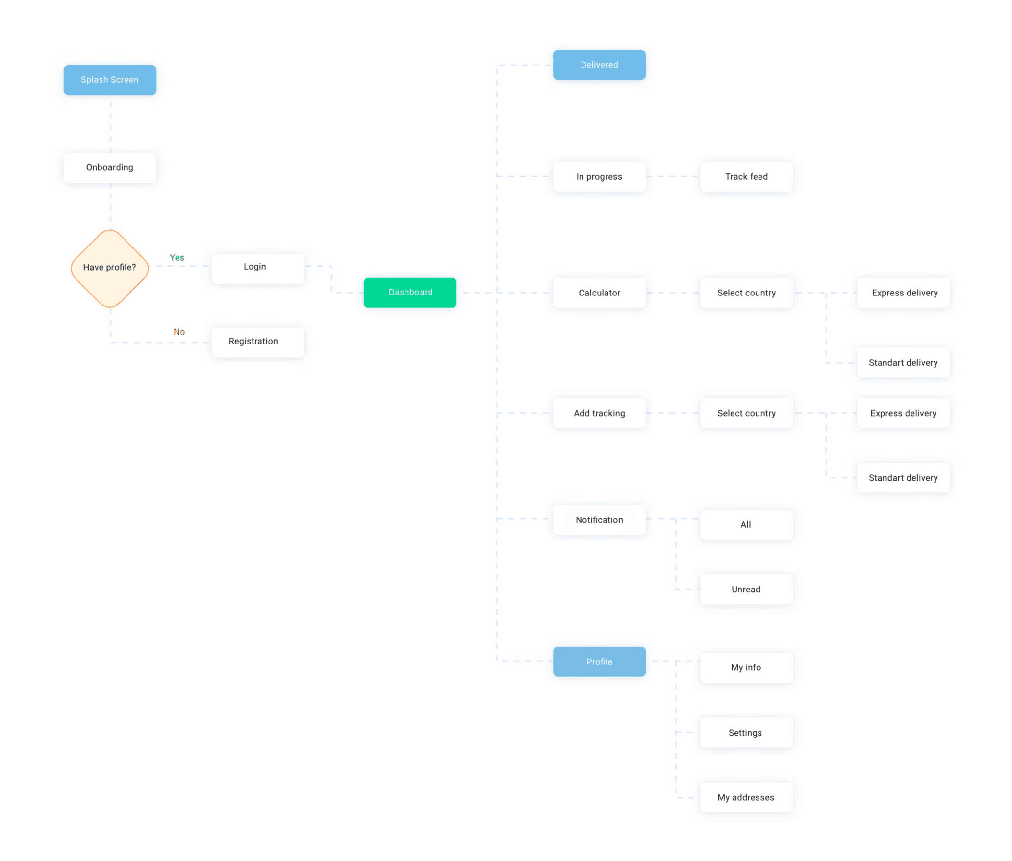
User flow
Before we started any research, we mapped out the user’s journey. My goal here is to highlight on a very BASIC level what’s the most straightforward path the user would have to take to track down their order.
Competitive Research
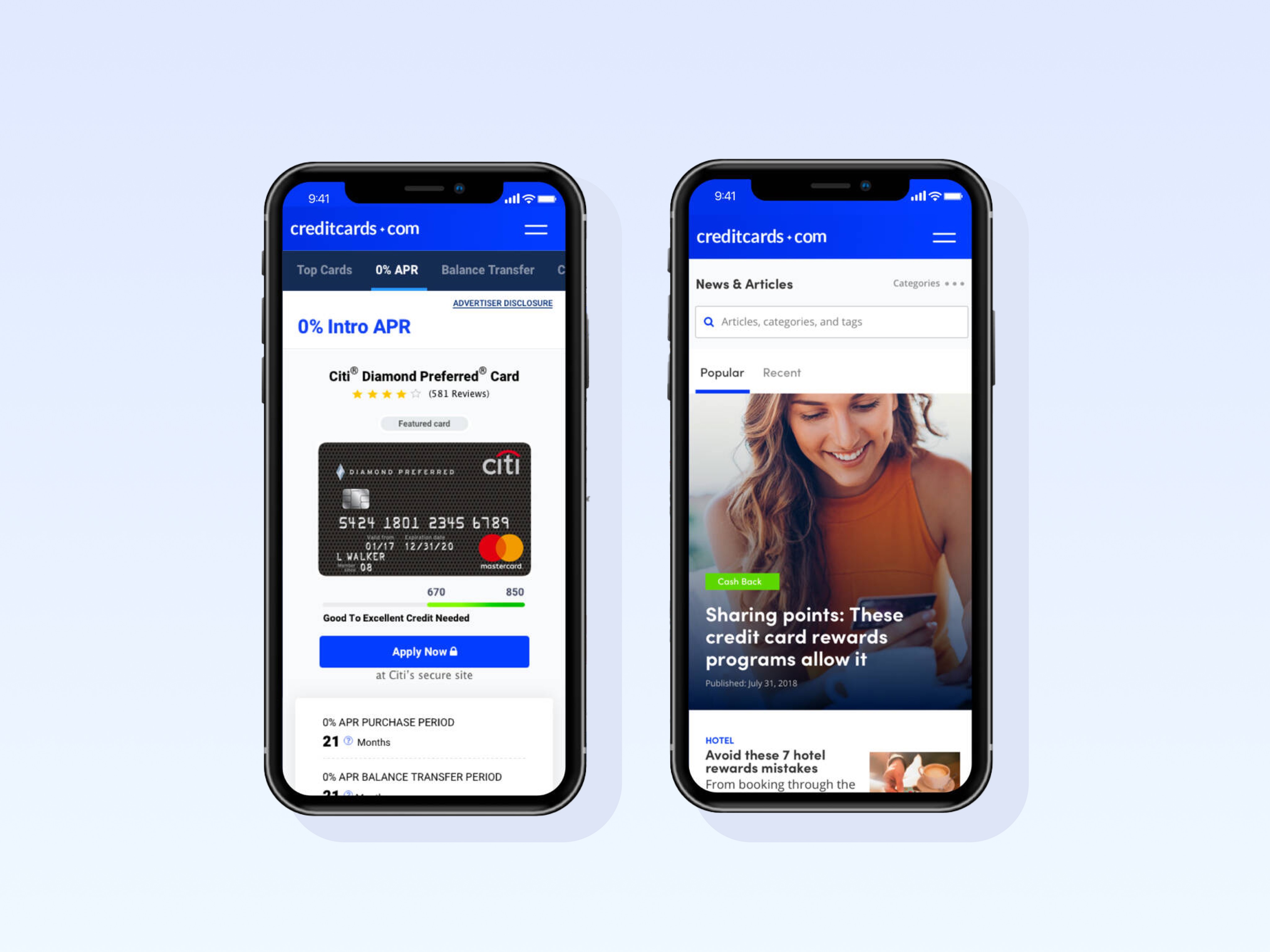
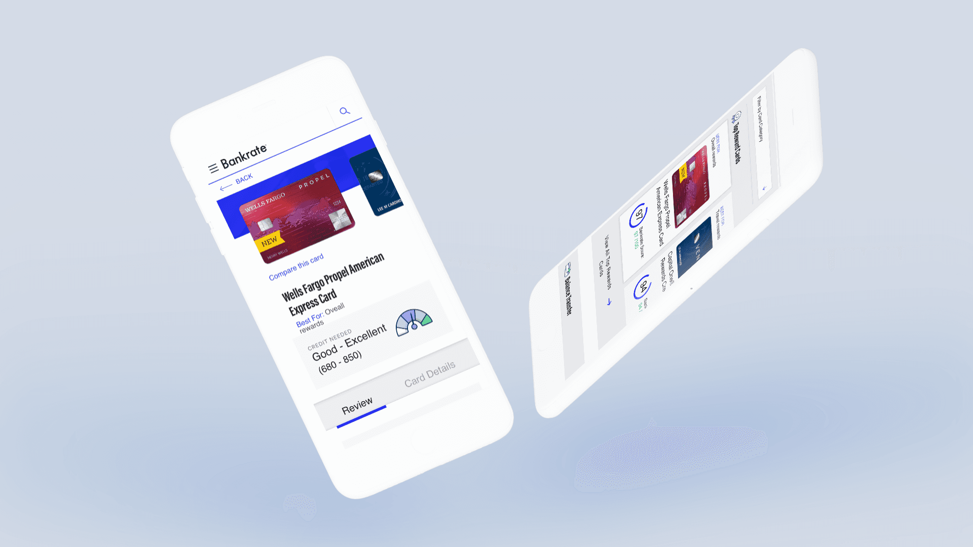
I studied a few delivery trackers in the industries to identify patterns and features their offerings to users. UPS and USPS have trackers that users can use to pinpoint a time of the delivery and overall journey.
They used maps to illustrate to show the entire journey.
Strong hierarchy
Busy interphases, overwhelm with content.
These trackers are web-based with mobile adaptations.
Tracking packages are somewhat complicated users would have to complete a series of steps before entering and track a specific package.
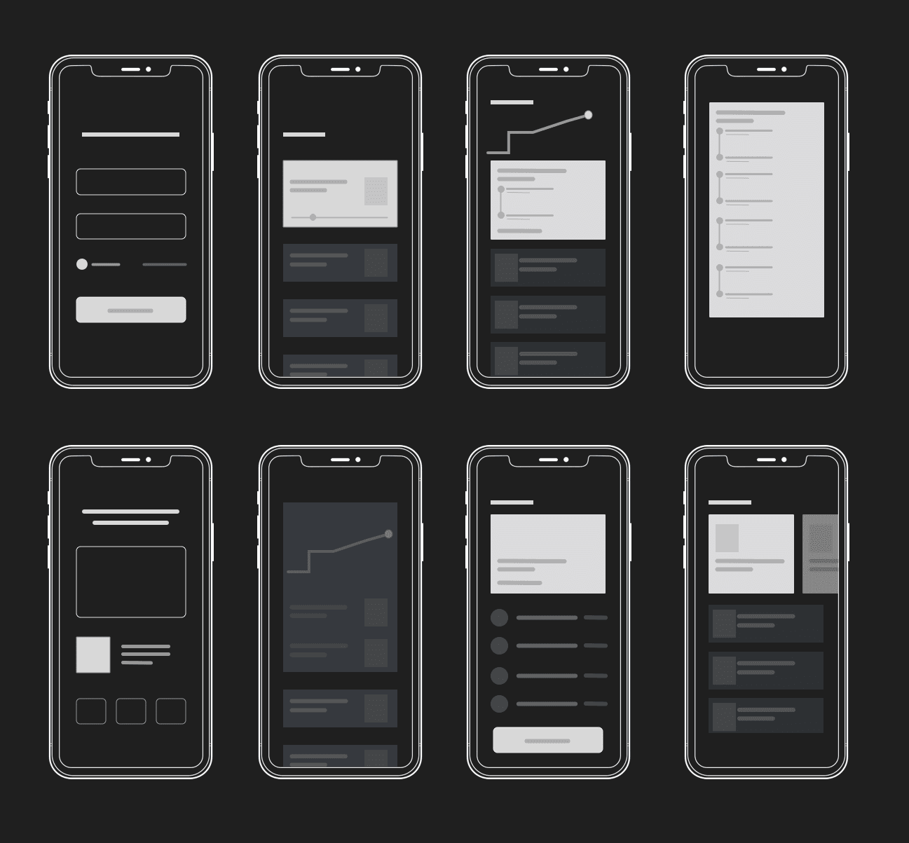
Sketches
After completing my initial research and gathering key insights, I began sketching early concepts to explore different ways to approach the user experience. These sketches served as a foundation for rapid ideation, allowing me to visualize multiple directions and test how different flows and interactions could solve user needs.
This hands-on approach enabled faster iteration, helping to surface the strongest ideas early on. Each round of sketching led to more refined solutions, providing a flexible path for adjusting and evolving the design based on feedback and emerging requirements.


Wireframes
User Testing: Round 1
Using invisionapp.com and usertesting.com, I launched a small test using a wireframe prototype to identify what our user’s needs are.
Feedback
Love the clean interphase, easy to track packages.
They appreciate the package overview features.
Map features seems a bit confusing
Some users seem to get stuck after selecting the full journey view.
Pivoting
Once I identified the users' needs, I revisited previous design work and created new, refined mocks using Sketch. I focused on simplifying the user experience by removing unnecessary UI elements while preserving and enhancing the ones that truly mattered. I also refined the visual design and crafted content that would convey trust, authority, and expertise—positioning us clearly as leaders in the field.
With the updated mocks incorporating the new design improvements, we were ready to move into user testing to validate the latest version and gather feedback for further refinement.
Interface exploration
User Testing: Round 2
Using invisionapp.com and usertesting.com, we are validating ideas, and testing if we improved comprehension and user experience around the tracker.
Feedback
Map UI complements the overall experiences.
Users were able to navigate back from the full journey view.
Relevant information was easily accessible.
Some users found it hard to use the notification feature.
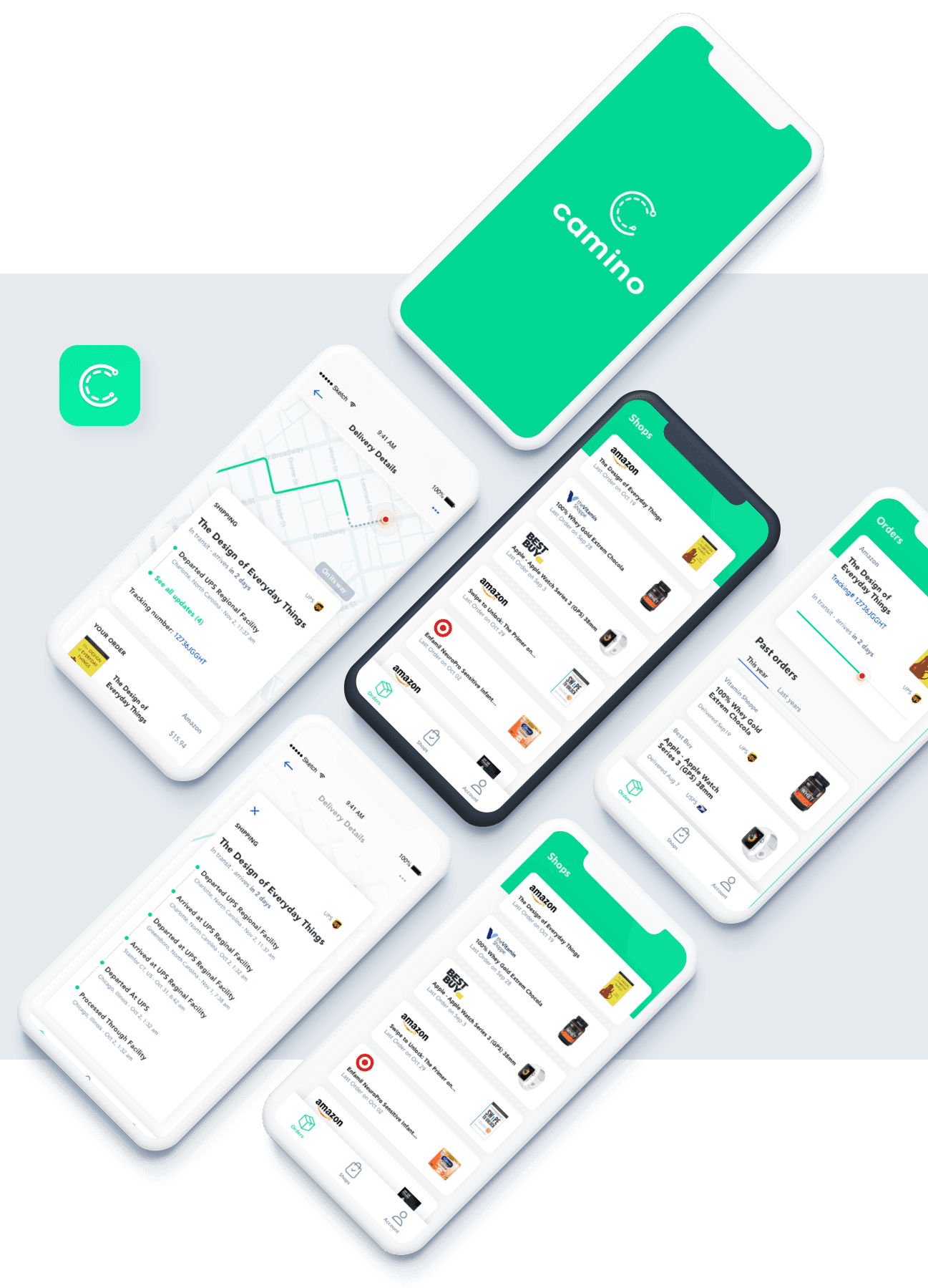
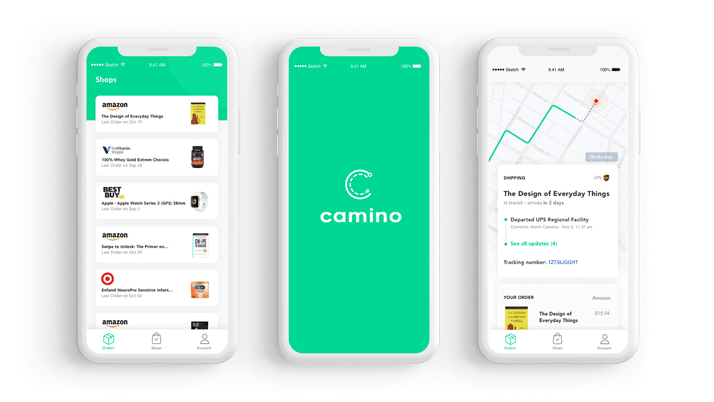
UI Design
After collecting all the user testing information, I began designing the final screens in Sketch. Using the there existing guidelines, we build multiple components to ensure design consistency throughout all filters.


Results
The redesigned experience made it significantly easier for users to navigate complex permitting processes. By simplifying the interface, focusing on clarity, and reinforcing trust through thoughtful visual and content decisions, we reduced user drop-off rates and improved task completion times. Early testing of the updated mocks showed higher user satisfaction scores, with participants highlighting how much "simpler" and "more trustworthy" the process felt.
The Take Away
Simplifying complex workflows isn't just about removing steps—it's about understanding user needs, highlighting what matters most, and building an experience that feels both empowering and trustworthy. With the right balance of clarity and authority, even the most intimidating processes can feel manageable.
When you simplify complexity with intention, you don't just make tasks easier—you make users feel capable, supported, and confident.


OTHER WORK
Claim Your Free 3 Months
Get 3 free months of Framer Pro Yearly Subscription when upgrading your plan with the code partner25proyearly
Sign Up Now