

Overview
The Simple Dollar is a platform for people to learn from one another and share real-life personal finance strategies. Their mission is to provide well-researched, useful content that empowers their readers to make smart financial decisions. In addition to the finance blog that made them famous, they now offer comprehensive guides on credit cards, investing, banking, insurance, and more.
Challenge
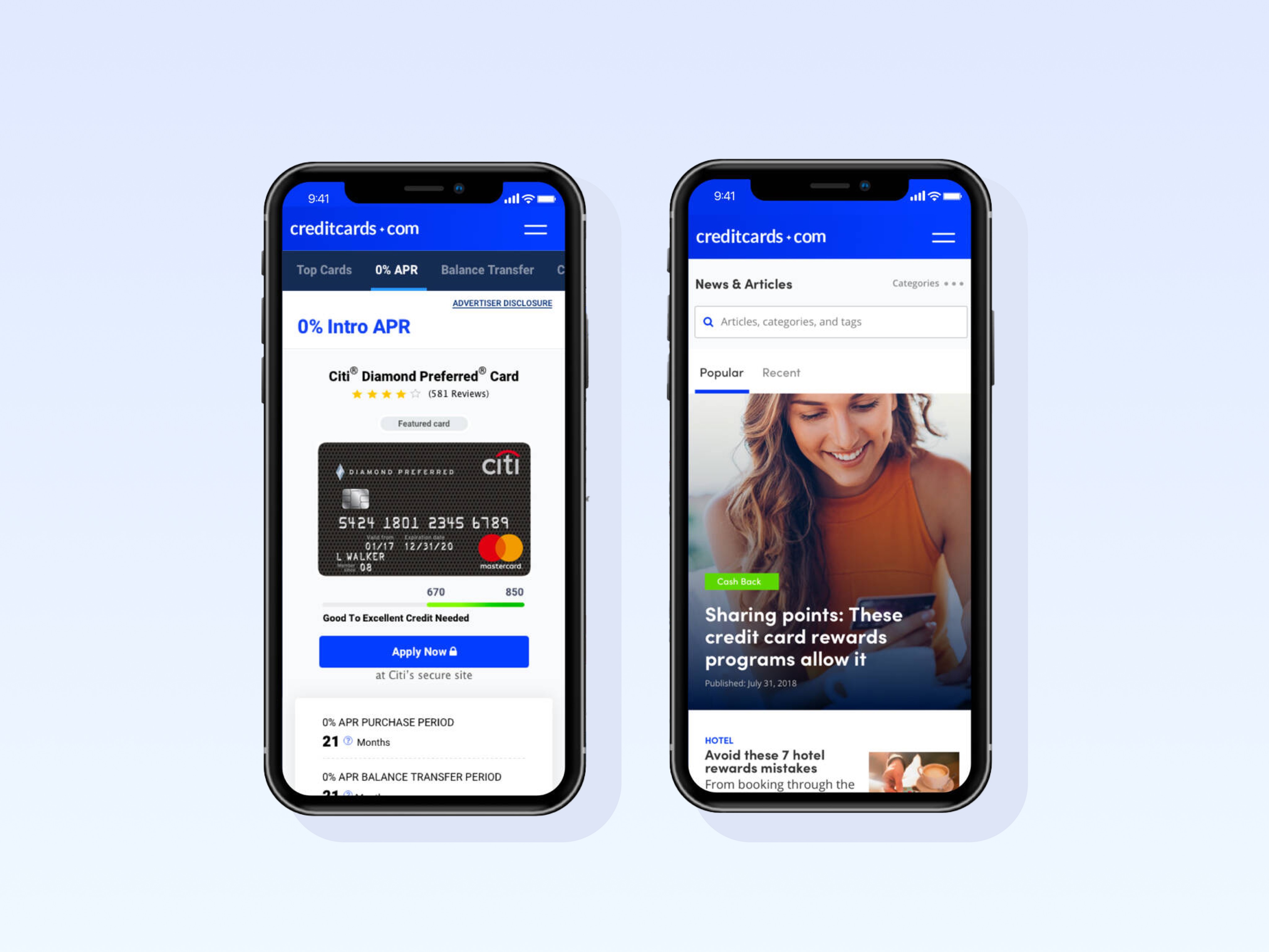
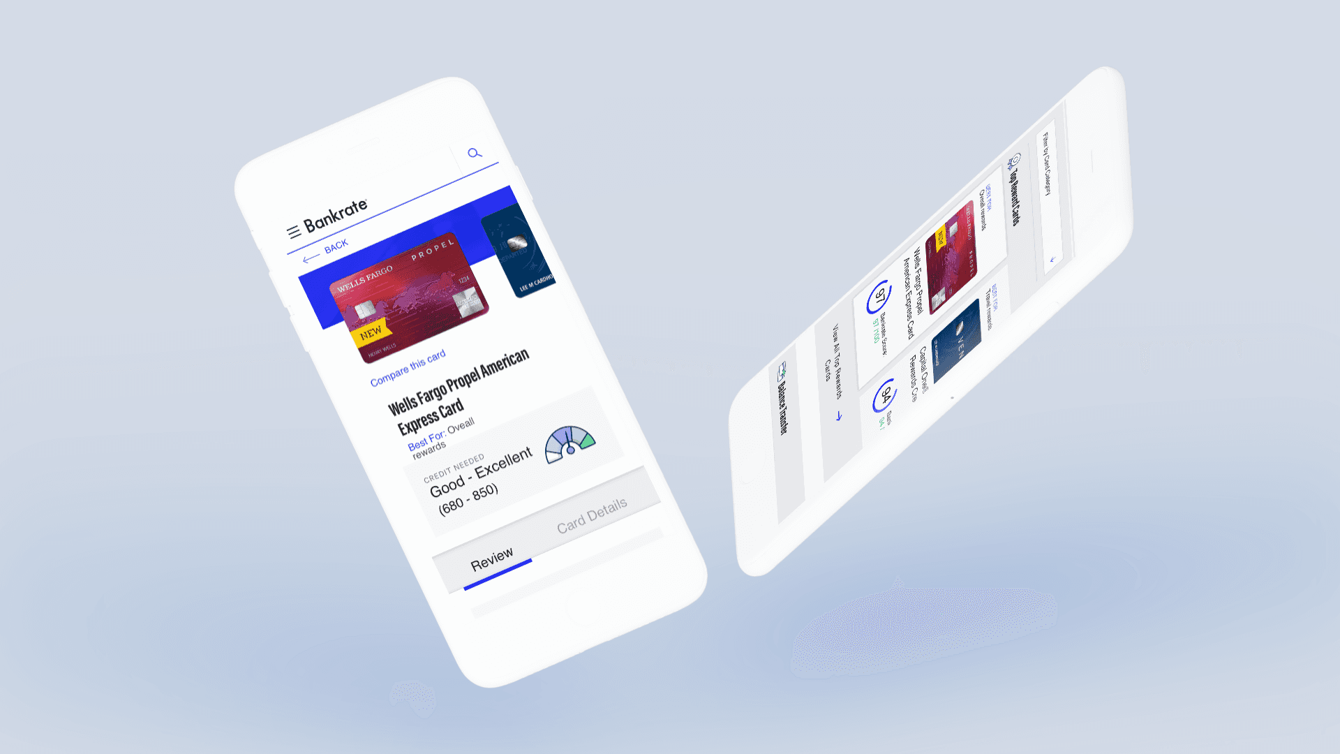
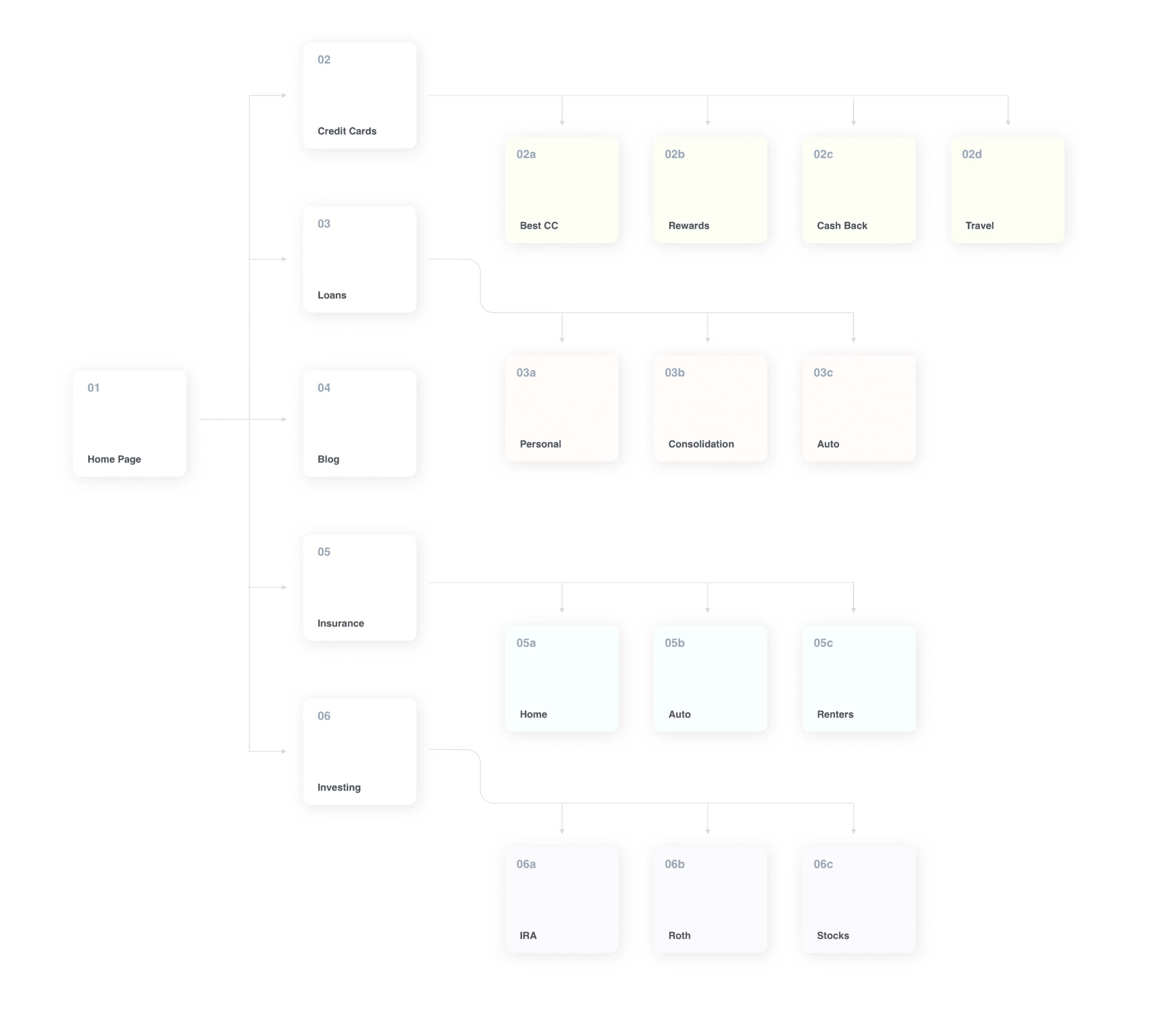
From a small personal blog to a large financial marketplace site, The Simple Dollar experienced amazing growth in the past few years, which required a new strategy. Our team was given the task of completely redesigning their website. The goal was to reach out to a new demographic with different needs, exploring other areas within finance to fulfill those needs, while staying true to the rich educational material that more traditional users knew The Simple Dollar for. Setting themselves apart from the competition was also a goal.
MY ROLE
Lead UX/UI designer
TEAM
4 Designers, 12 Developers, 2 UX writers, 1 Project Manager
DONE WITH
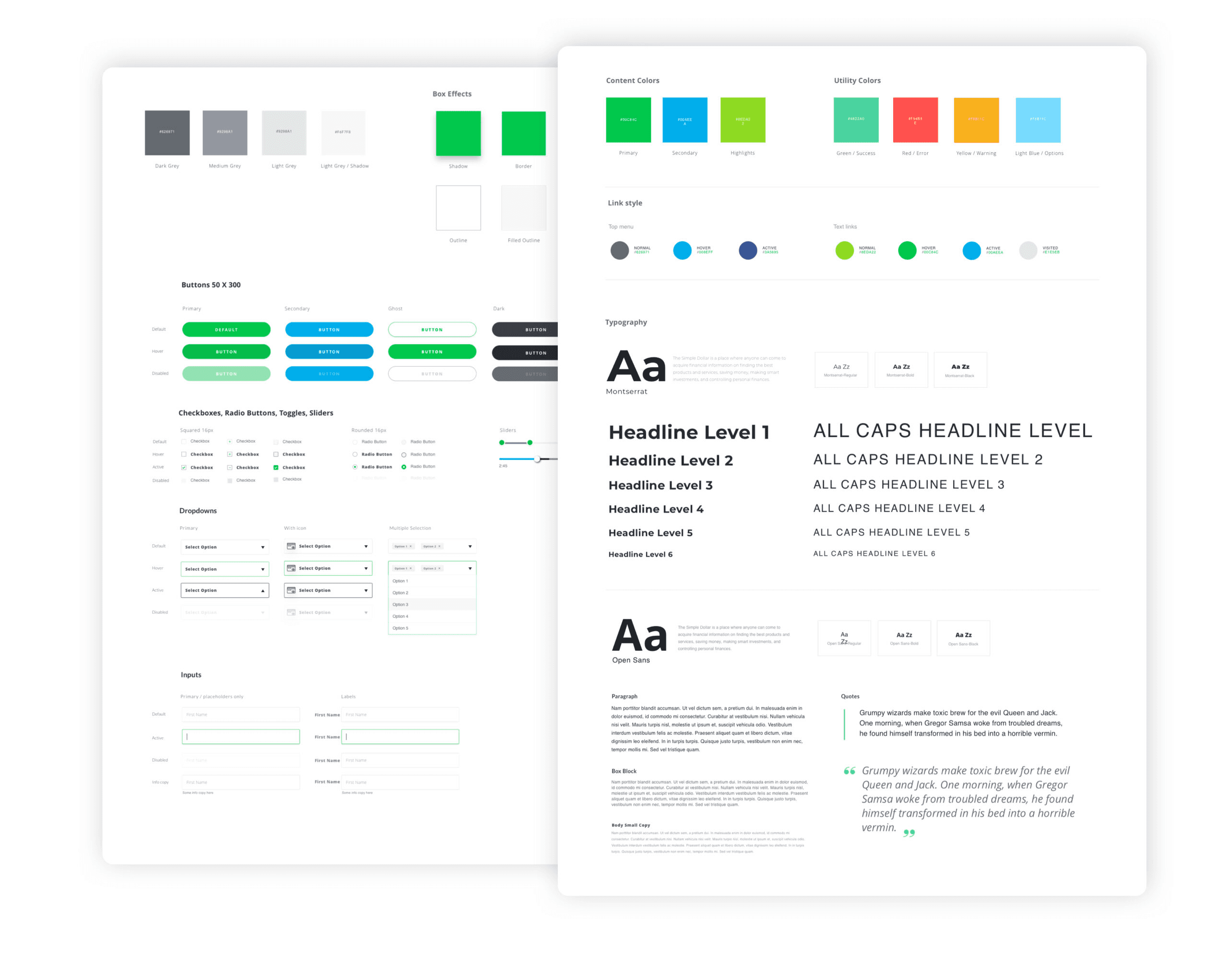
Figma, Illustrator, ChatGPT, Relume, Lovable, Maze
INDUSTRY
FinTech

Outcome
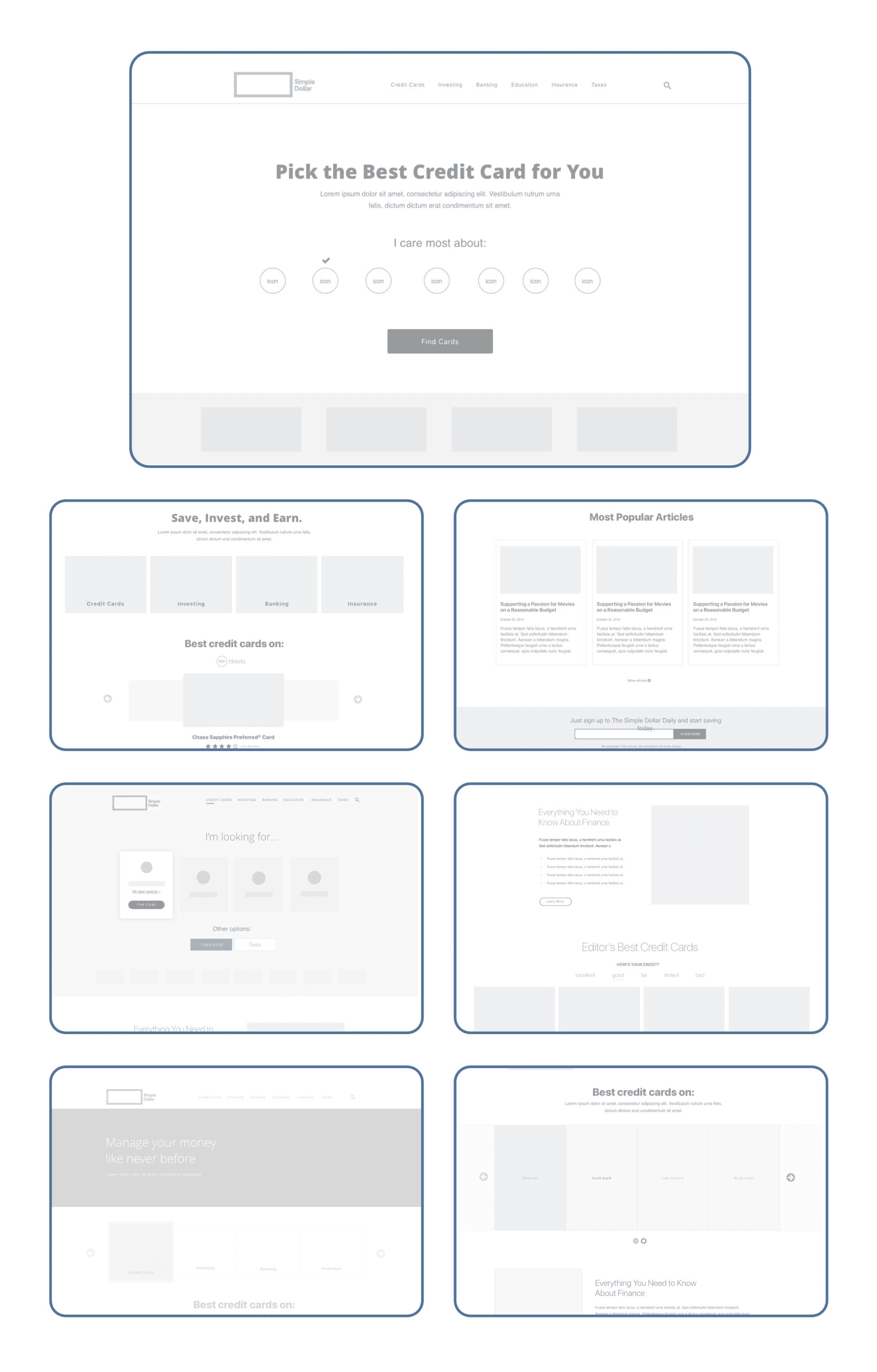
Through an extensive and thoughtful design process, we conducted deep user research, explored multiple rounds of paper sketches, developed high-fidelity wireframes, and continuously refined our approach through countless iterations. Every step was guided by real user feedback, usability testing, and a commitment to solving the core problems our audience faced.
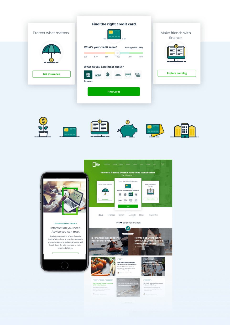
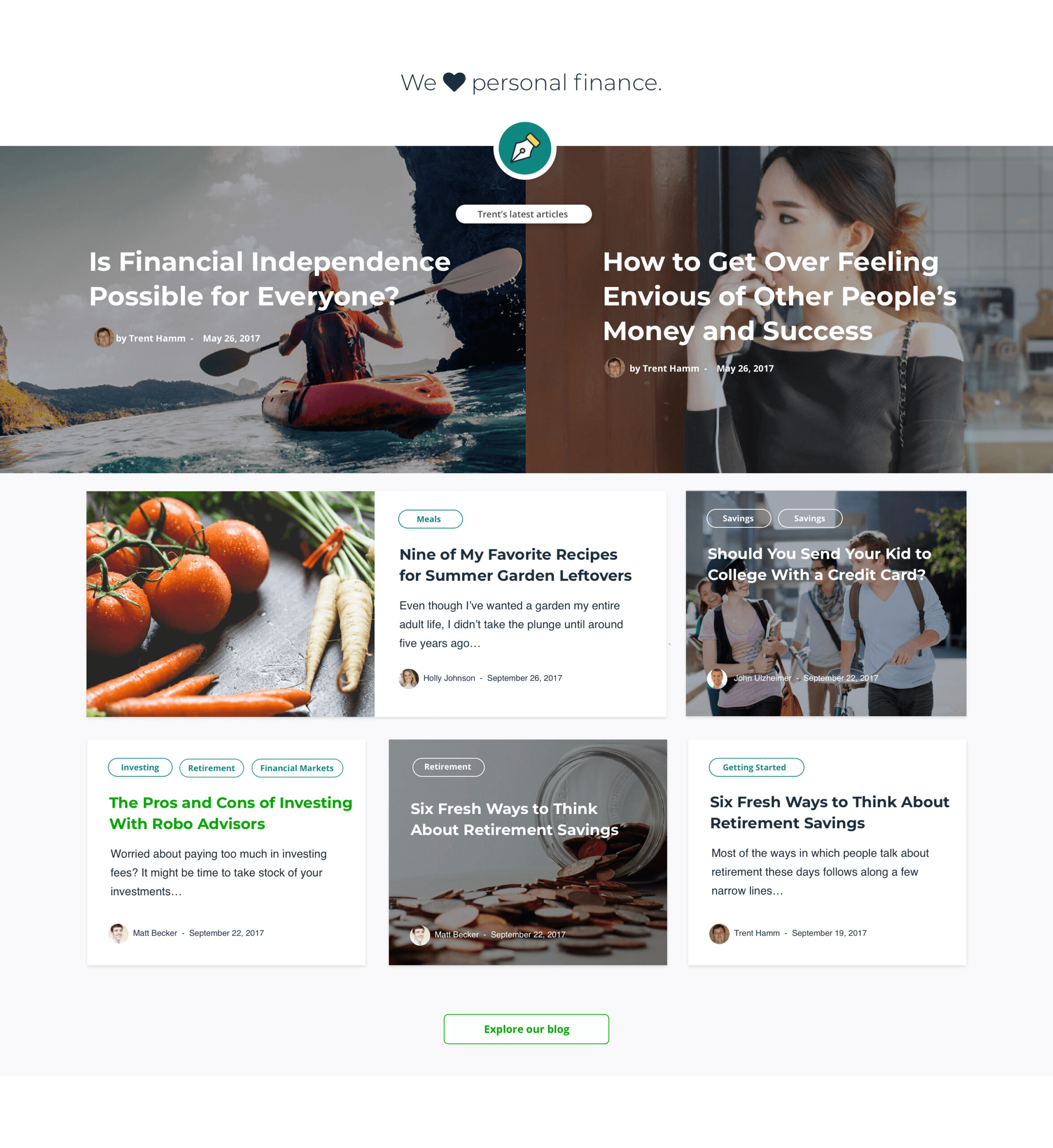
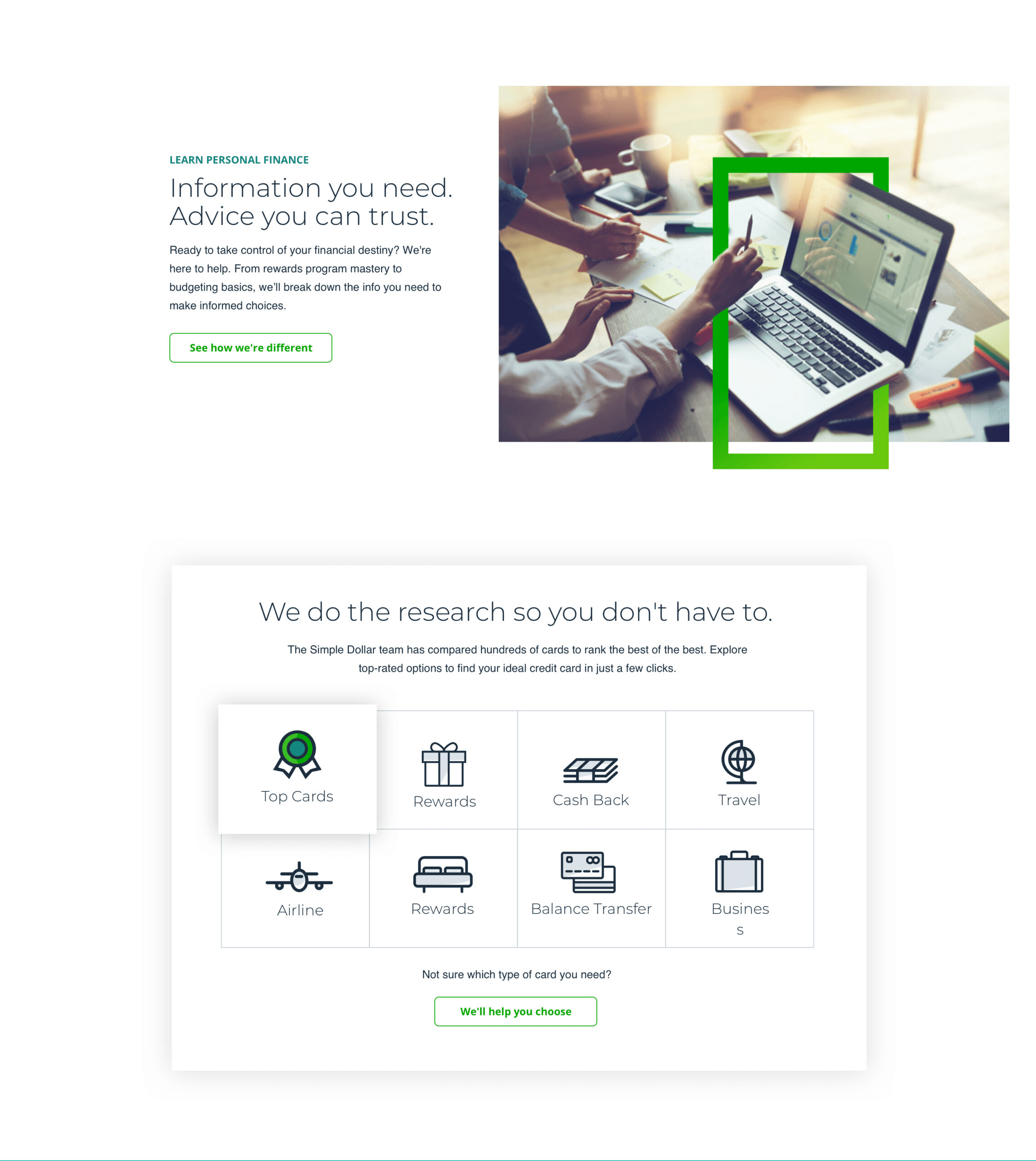
The result is a product—and brand—that we are truly proud of. The new site feels fresher, cleaner, and significantly more intuitive, providing users with a streamlined experience that balances simplicity with depth. Navigation is easier, information is more accessible, and users are able to find, compare, and act on financial decisions with greater confidence.
Ultimately, the redesign not only modernized the look and feel of the brand, but it also meaningfully improved the overall usability, setting a stronger foundation for future growth and user trust.
Results
The redesigned Simple Dollar experience made it easier for users to navigate complex financial topics, resulting in a 24% increase in time spent on key pages and a 20% boost in user engagement. Improved content organization and clearer comparison tools helped users feel more in control of their financial decisions. Usability testing showed that users described the new experience as “simpler,” “more trustworthy,” and “less confusing,” reinforcing the success of the new design approach.
The Take Away
By focusing on clarity, trust, and simplicity, we transformed a complex financial experience into one that empowers users to make smarter decisions with confidence, leading to stronger engagement, higher conversions, and deeper brand loyalty.