
Overview
LendingTree connects millions of Americans with loan and financial solutions—from credit cards to mortgages. But with legacy structures and uneven branding across its marketing ecosystem, we needed to modernize key moments of the experience.
Objectives
Our primary objectives were to improve clarity and usability across high-traffic pages, increase user trust while reducing friction in financial flows, unify the design language across marketing and product touchpoints, and enhance mobile responsiveness to support stronger conversion performance.
MY ROLE
Senior UX/UI Designer, Visual Designer
TEAM
1 Product Manager, 4 Designers, 12+ Developers, 1 Writer
DONE WITH
Figma, Illustrator, Photoshop, ChatGPT, Miro, Zeplin
INDUSTRY
Fintech

Designing for Trust, Clarity & Performance
We needed to support diverse financial products while increasing conversion across high-volume pages, establishing visual consistency, simplifying complex offers and copy for non-expert users, and making the UI feel credible, calming, and mobile-first.
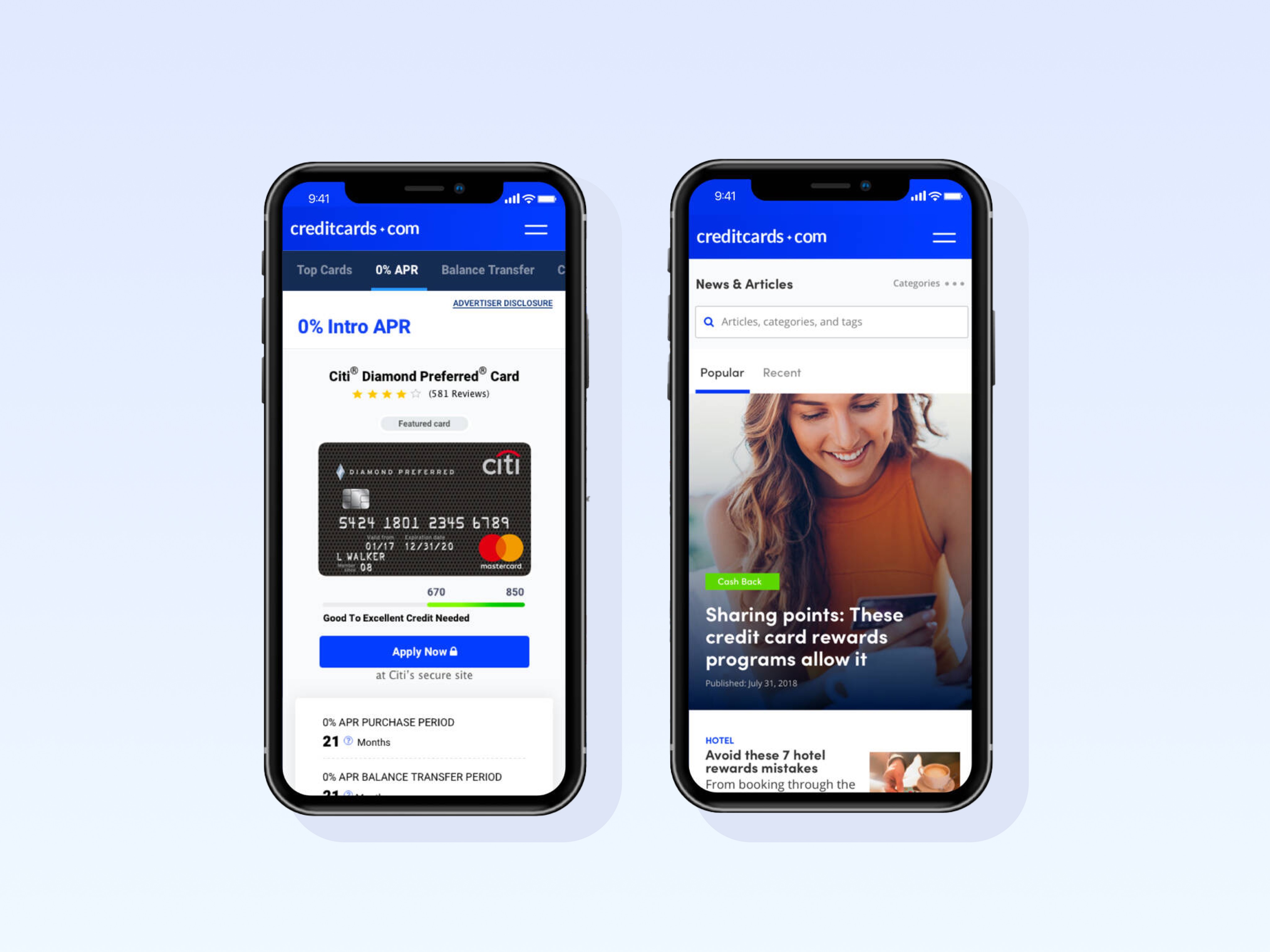
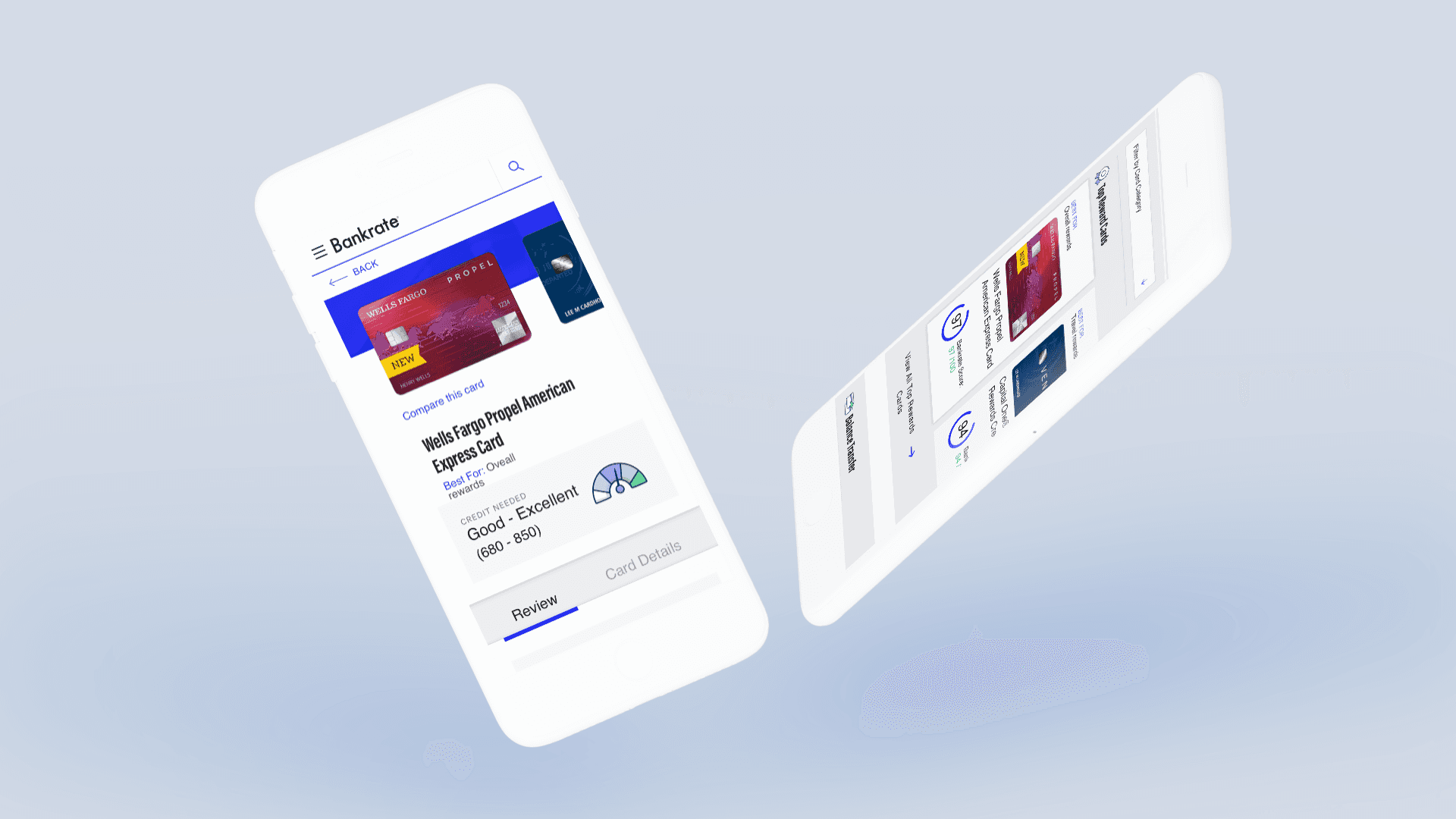
Landing Page Redesigns That Convert
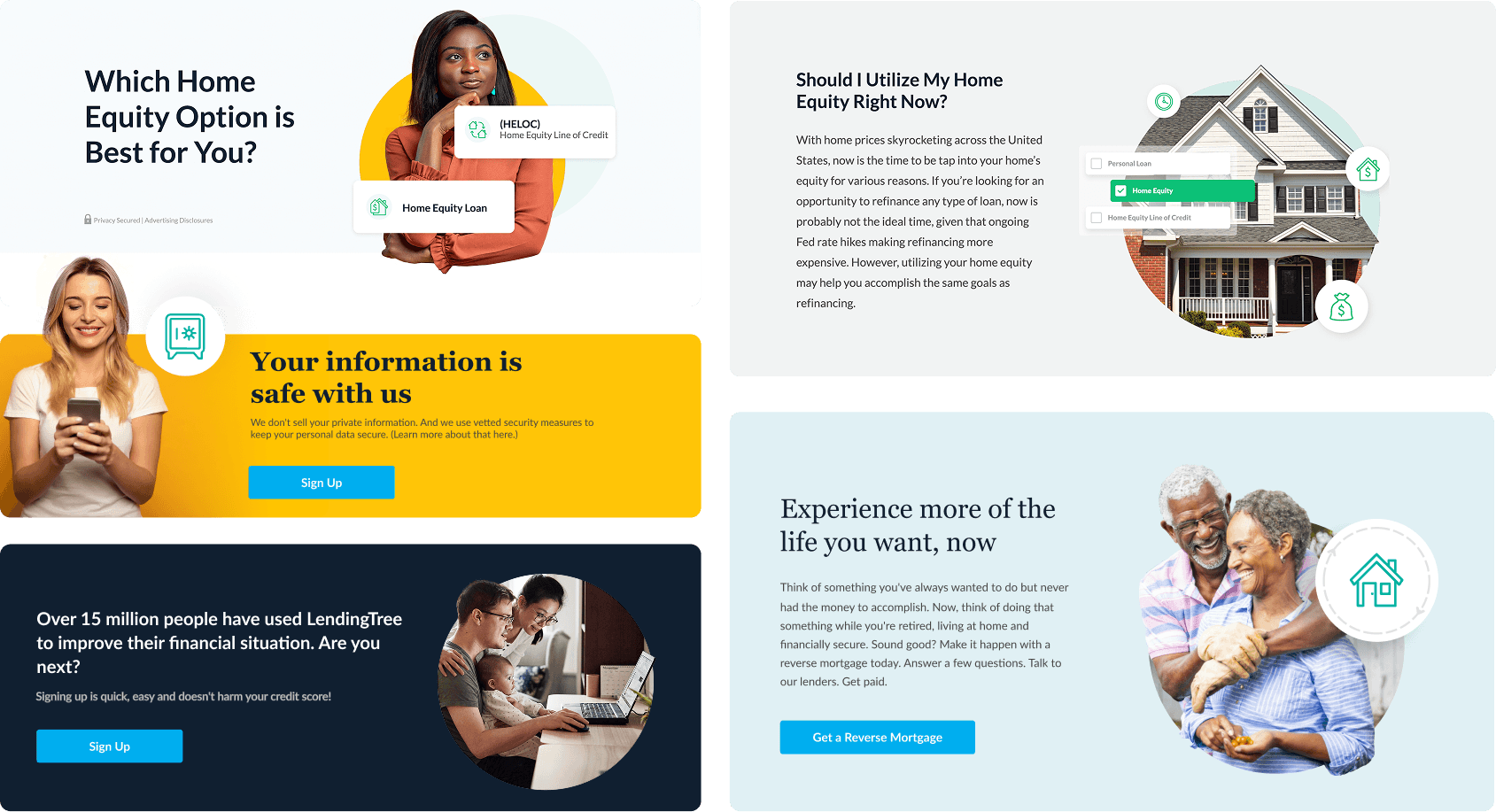
Modernizing the LT Homepage
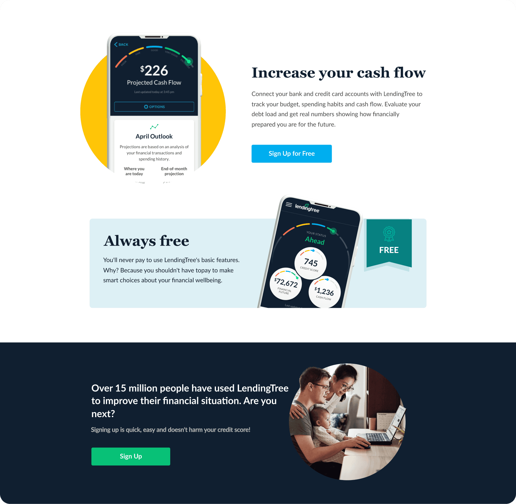
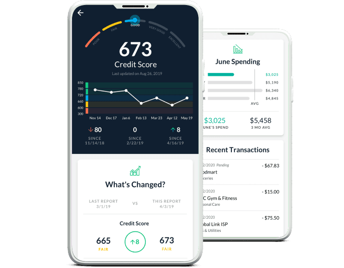
I led the full redesign of the LendingTree homepage—from wireframes to final UI—working closely with product, brand, and marketing stakeholders. The new homepage introduced a fully modular layout system, personalized dashboards, refreshed illustrations, a streamlined financial snapshot UI, and trust-building components like customer testimonials and lender credibility indicators.
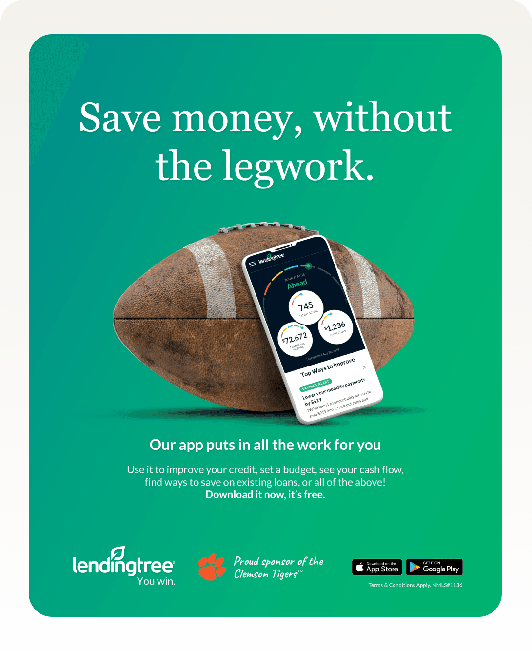
Campaign & Marketing Materials
As part of my case study, I am utilizing the “Shipment List” module. This module is a crucial element of the application, featuring six key components including filters, timelines, a map, container view, custom views, and a Prediction Score.
After creating the mockups, I remained involved in the project, overseeing QA and user testing.


Impact
The redesign work at LendingTree led to measurable improvements across core performance metrics and user experience benchmarks. Redesigned landing pages showed up to a 23% increase in conversion rates, thanks to better page structure, clearer CTAs, and mobile-first layouts. Over 10 marketing pages were consolidated and restructured using a flexible set of UX patterns, which reduced development time and enabled faster iteration for A/B testing and campaign launches. The new unified design system brought consistency to the homepage, product pages, and campaign materials—establishing a stronger brand voice, improved usability, and better visual hierarchy across the entire ecosystem.
The Take Away
Finance is emotional—design must instill trust instantly
Small UX shifts (like clearer copy, visual hierarchy) deliver major impact
Design systems speed execution across teams without sacrificing polish