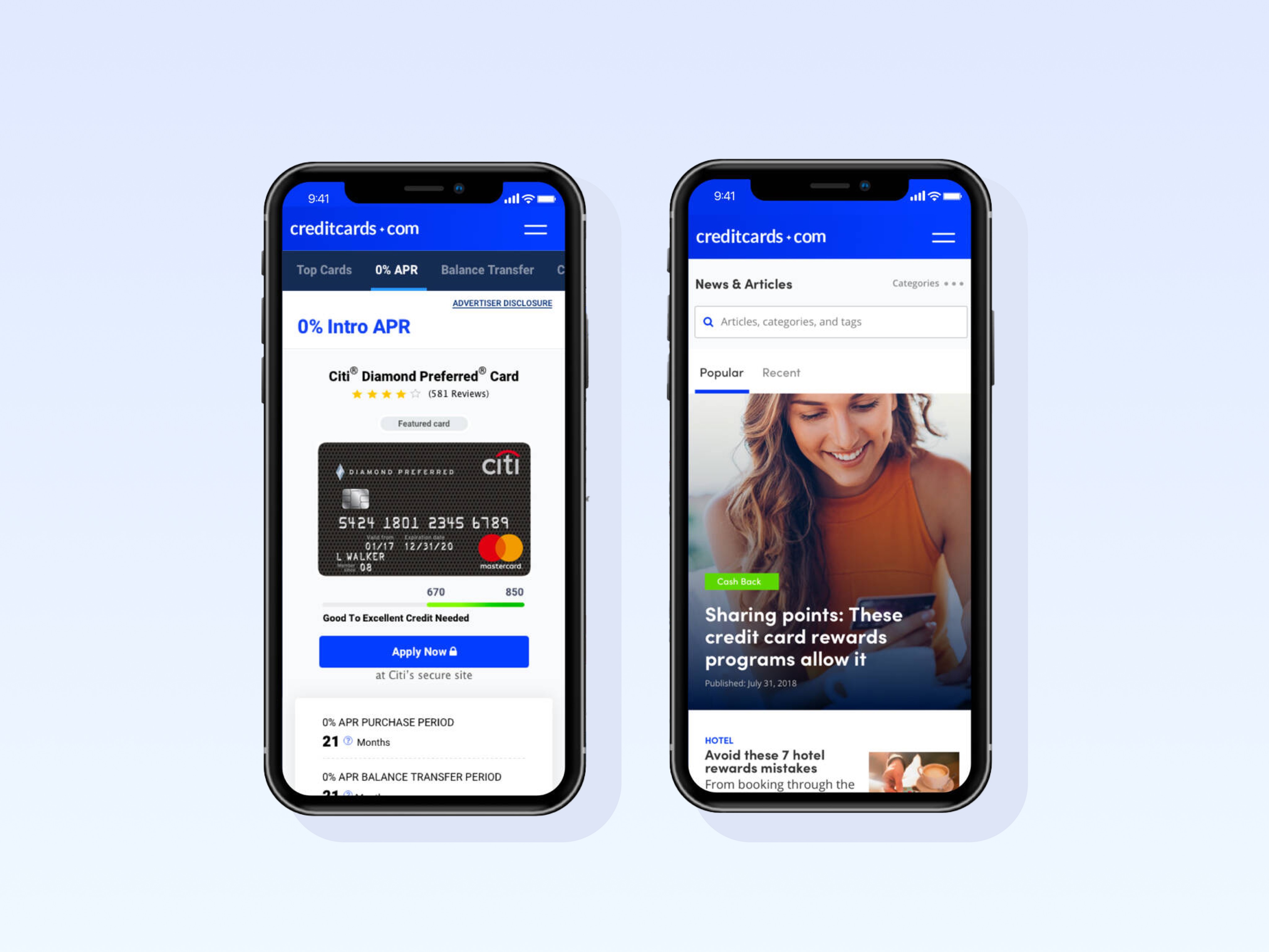


Challenge
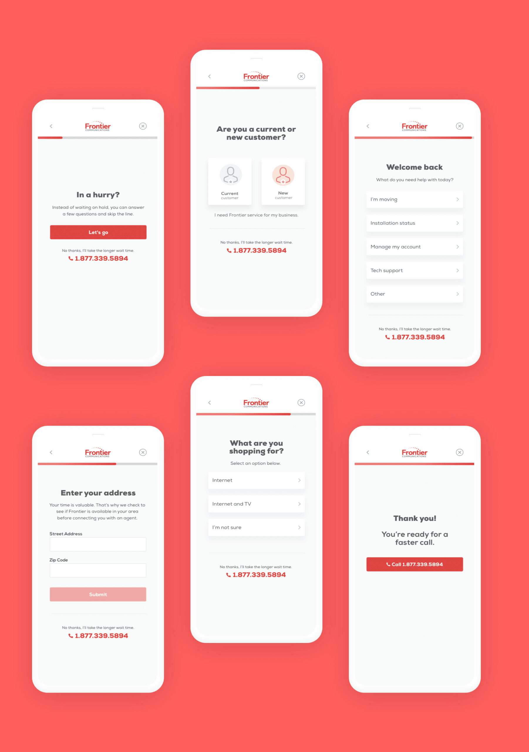
The primary goal for this project was to identify and engage users earlier in the funnel to improve lead quality and conversion rates. To achieve this, we focused on creating and testing multiple variations of the hero experience — including different messaging strategies, visual layouts, lead capture forms, and content structures.
Through an iterative process of A/B testing and analyzing user behavior, we refined each version to better align with user intent and business goals. After multiple rounds of experimentation, we identified a winning experience that not only improved user engagement but also significantly increased early funnel identification. This final version delivered a clearer value proposition, simplified the user decision-making process, and provided a more seamless path to conversion.
MY ROLE
UX and Visual Designer
TEAM
4 Designers, 12 Developers, 2 UX writers, 1 Project Manager
DONE WITH
Sketch, Illustrator, ChatGPT, Relume, Lovable, Maze
INDUSTRY
Telecommunications
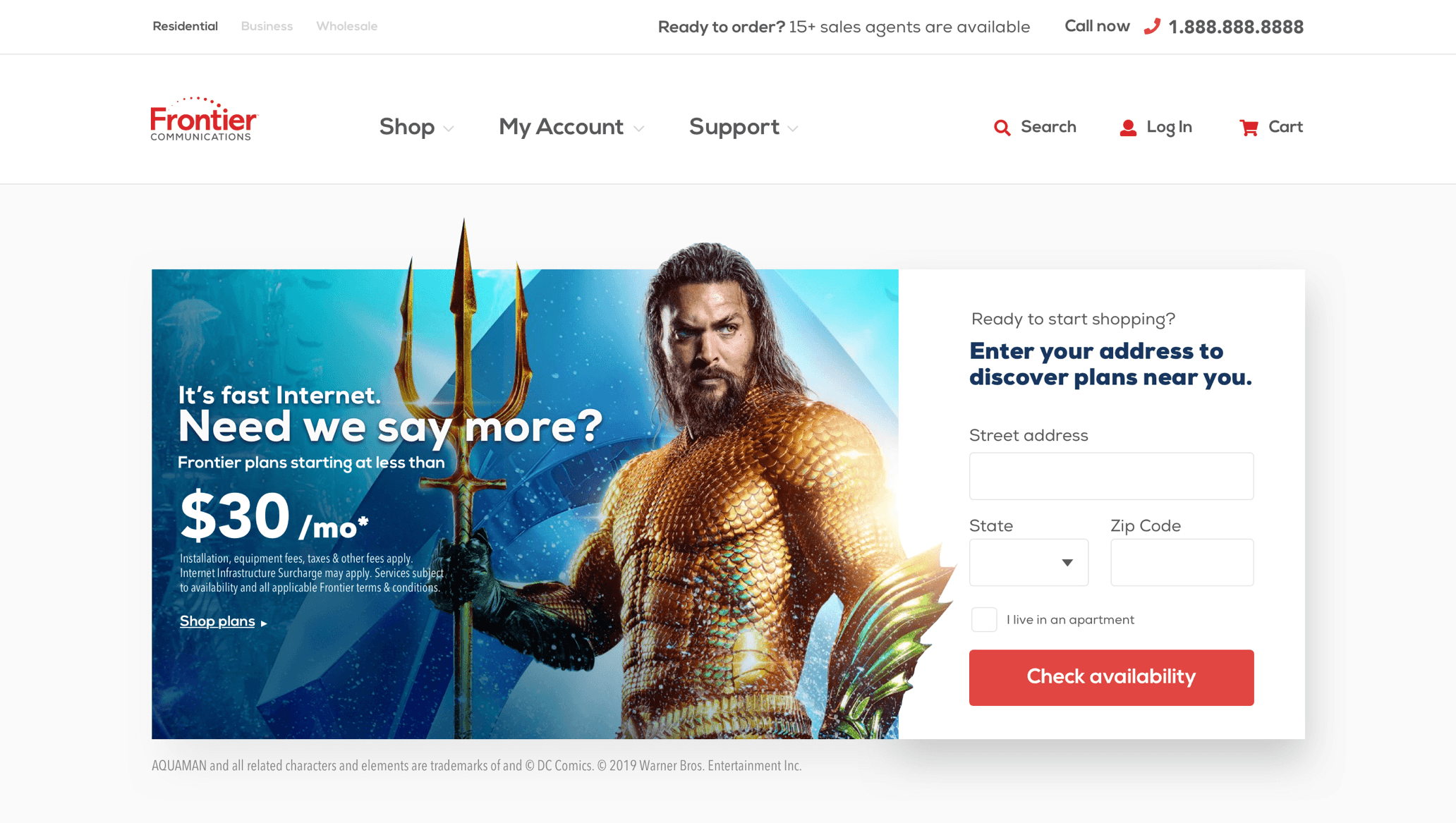
Frontier has built a strong reputation as a leading provider in the telecommunications industry, known for delivering dependable internet, TV, and phone services to millions of customers.

Feedback Loop
Another challenge we encounter was the fact that Frontier API call is extremely slow, with an average of 1minute wait from when a user enters their zip code till when they get their results.
We conducted a small test group to figure out an experience that would keep the user more engage and reduce the breakage; we team up with our developers to design a loader that would allow users to get live feedback of their status while the page load.
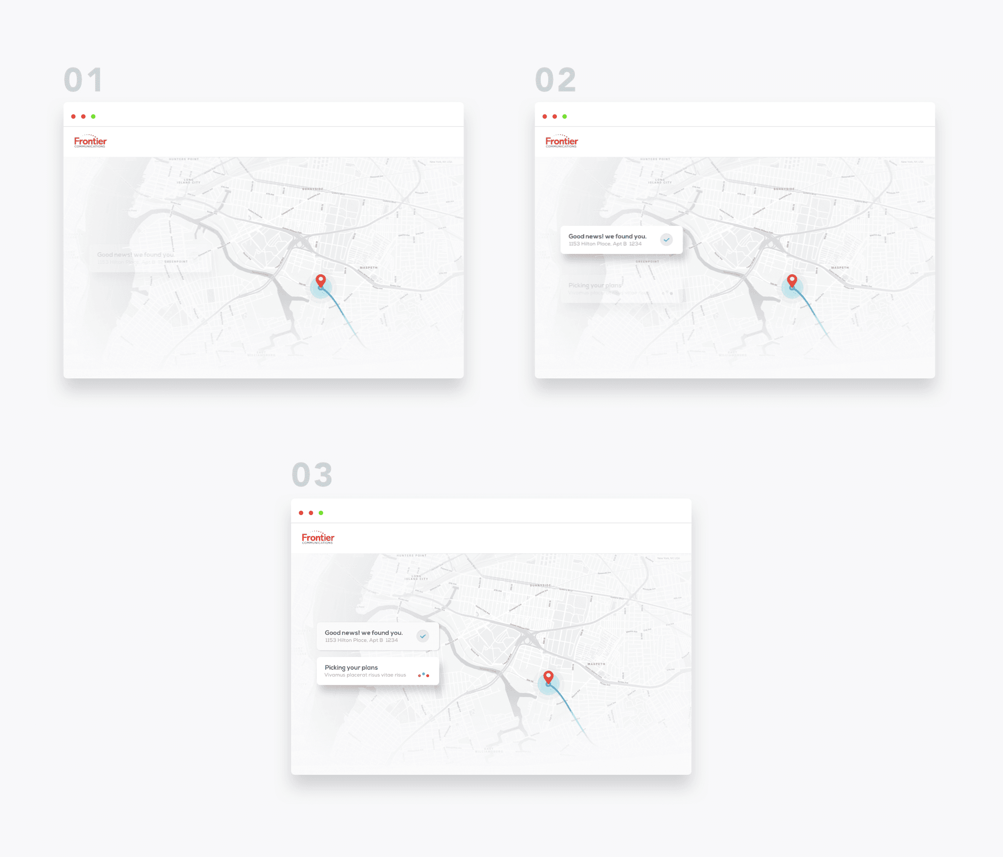
After a user enters their zip code, they will see an animation of the map targeting their location.

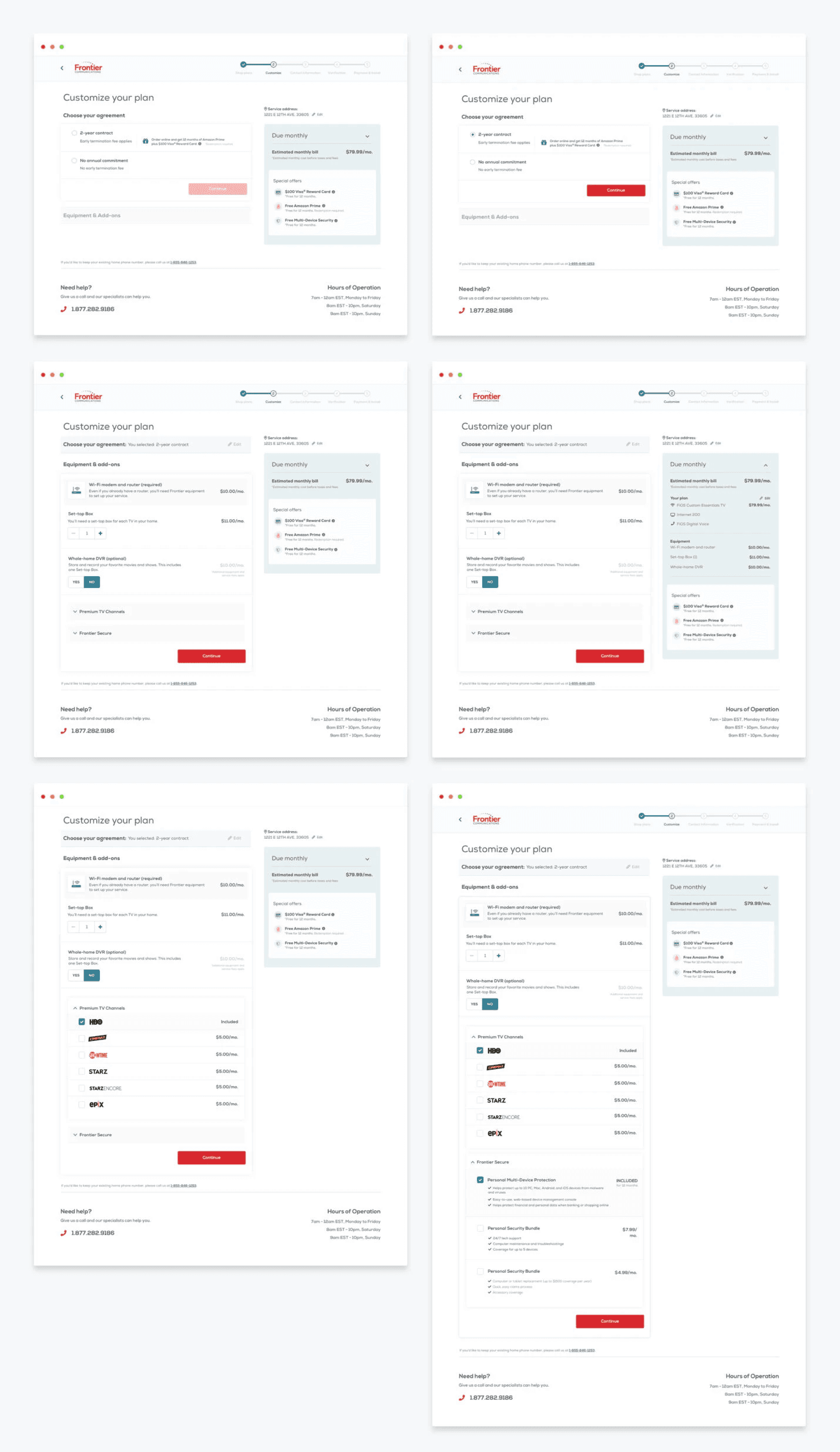
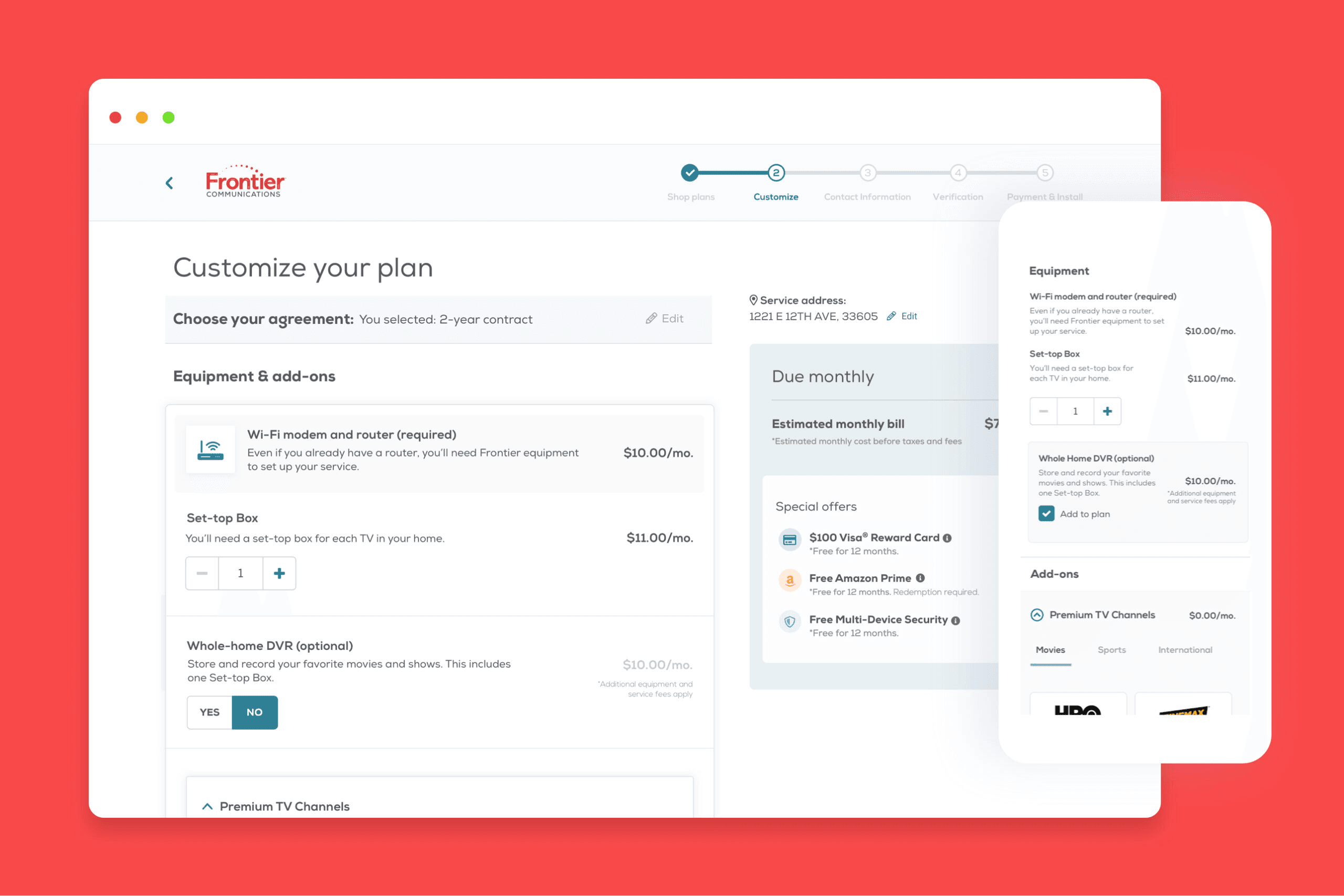
Simplifying the Cart Experience
The most significant task of this project was the redesign of the cart experience. The main problem with the old experience was the lack of guidance and transparency. The new design brakes all the steps into sections, making it easier to digest for users.

Results
The redesign led to measurable improvements across the Frontier experience. Breaking the checkout process into smaller, guided steps reduced user confusion and increased cart completions. By designing a real-time loader during slow API calls, we kept users engaged, helping to reduce abandonment rates. Early funnel experiments also resulted in stronger lead capture, improving overall conversion metrics across key landing pages.
The Take Away
Small experience details—like how you handle loading states or structure a checkout flow—can make a major impact. By focusing on transparency, user feedback, and guiding users step-by-step, we were able to turn friction points into moments of trust and progress.