

Overview
Many fitness apps overwhelm users with data, jargon, or inconsistent plans. FitApp was created to simplify training for real people—those juggling life, work, and health goals. My challenge was to create a product that motivates without intimidating, and guides without micromanaging.
Objectives
We set out to deliver daily guidance without decision fatigue, making workouts and habits feel achievable rather than overwhelming. Our goal was to reinforce progress through subtle accountability features while keeping the interface warm, human, and coach-like—offering support without pressure.
MY ROLE
Freelance Designer
TEAM
1 Designer, 2 Developers, 1 Founder
DONE WITH
Figma, Illustrator, ChatGPT, Relume, Lovable, Maze
INDUSTRY
App

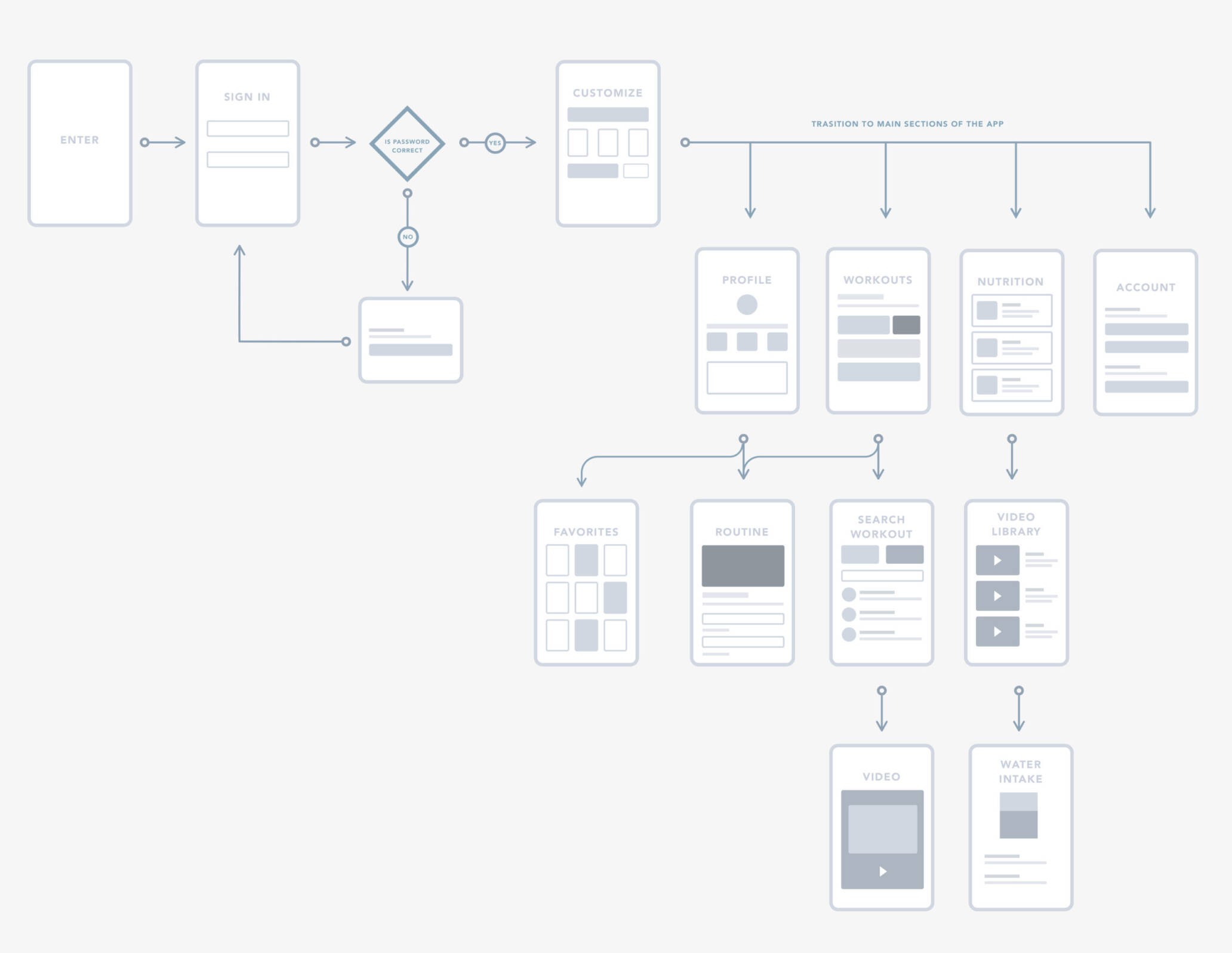
User flow
My aim here is to highlight redundancies in our existing workflow and target opportunities for improvement.
“Before I began any analysis, I create a user flow for the current fitness tracker”.
Competitive Analysis
I studied a few fitness trackers in the industries to identify patterns and features their offerings to users.
They used videos to illustrate how exercise performed.
The most crucial information was BIG or highlighted using Color.
Strong hierarchy
Ability to customize progress stats (Calories burned, Strenght, etc.)
Most trackers are offered for free with limited features, with monetization through ads and unlocking additional features with premium membership

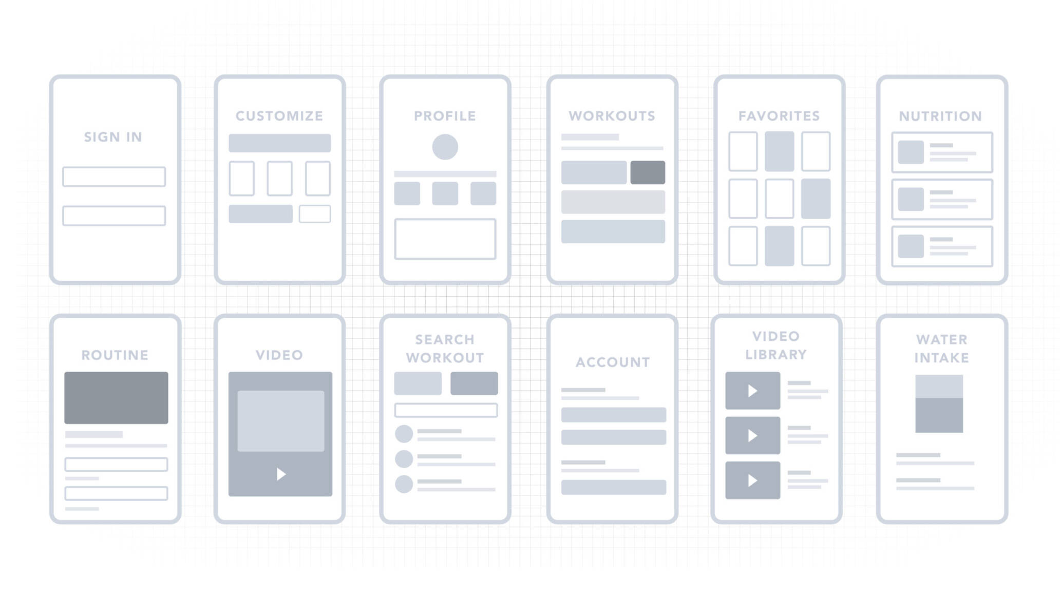
Wireframes
User Testing: Round 1
Using invisionapp.com and usertesting.com, I started a small test using a wireframe prototype to classify what our user’s needs are.
Feedback
The new features were well received, users see value on them and say they would pay extra to have these added it to the current experience.
Overall, interphase was a bit busy and confusing.
Tracking progress, editing, and deleting workouts needs to be simplified.
Creating workouts seems too complicated.
Emotionally, users feel like they can trust the product, yet they perceive as the app is lacking “identity.”
Usability Tests
25%
Confusing
85%
Wanted to know more
100%

Pivoting
Once I recognize the user’s needs, I revisit previous work and create new mocks using Sketch. I also removed unnecessary UI elements (while keeping the ones that matter), simplifying the user experience, and worked on visual elements and content that would convey trust and authority, setting us as the experts in the field.
Now, we need to test the most current version with the latest mocks containing the new component.
Interface analysis
User Testing: Round 2
Using invisionapp.com and usertesting.com, we are validating ideas, and testing if we improved comprehension and user emotions around using the app.
Feedback
A better understanding of interphase flow.
Huge win!
Most users trusted us more because of the cohesive message and overall visuals.
Happy with results here, but we are planning on introducing other elements to help the brand to align better with there to keep improving trust.
Usability Tests
14%
Confusing
20%
Wanted to know more
100%


Next Steps
Interview personal trainers to determineIf they set goals and what they areHow they measure goals & what metrics they useWhat their clients want to see for progress
Interview the clients of personal trainersAsk why they decided to use a personal trainerWhat do they expect from the app?Does the app help accomplish those goals?
Work with developers and engineers:Hand off design files to development team.Write design documentation with design specifications.Ensure Invision boards are updated and files are exportables.
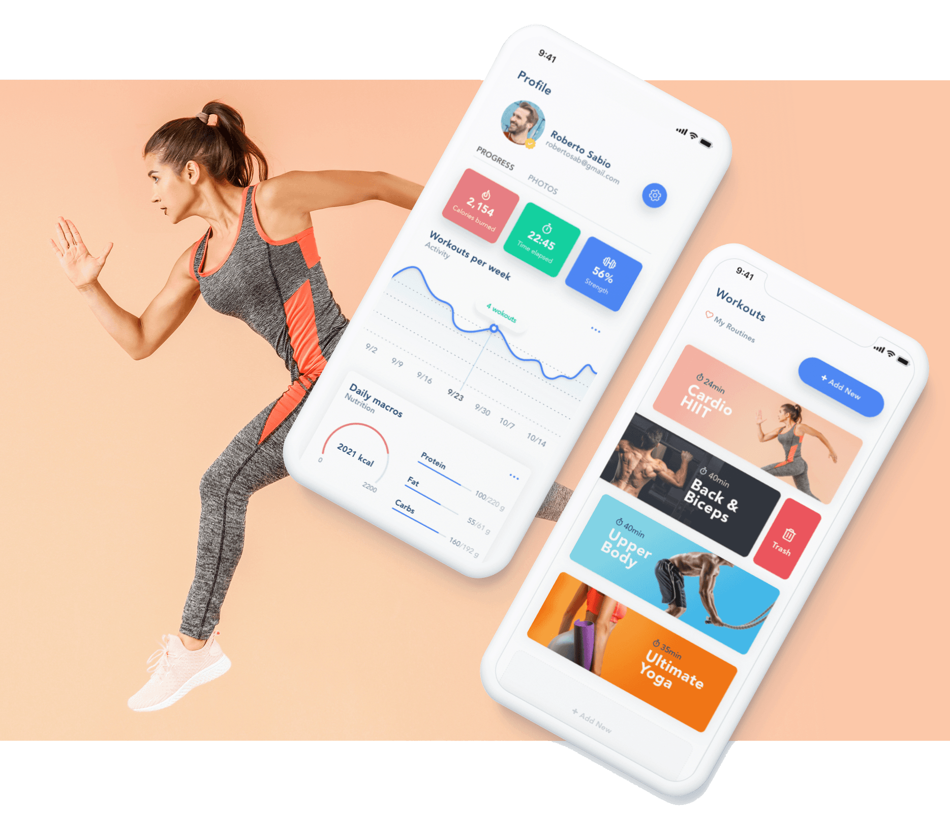
The Take Away
After finding all usability mistakes through testing, I began designing the final screens in Sketch. Using the design system components and guidelines, I started creating mobile displays first.
I am especially proud of the graphs and workout breakdowns. Making sure our users understand how to use the app, simplify their experience, and being transparent about what features included are our number one priority.
Designing FitApp taught me how to create space—for progress, for balance, and for users to feel supported without pressure.


OTHER WORK
Claim Your Free 3 Months
Get 3 free months of Framer Pro Yearly Subscription when upgrading your plan with the code partner25proyearly
Sign Up Now