


Challenge
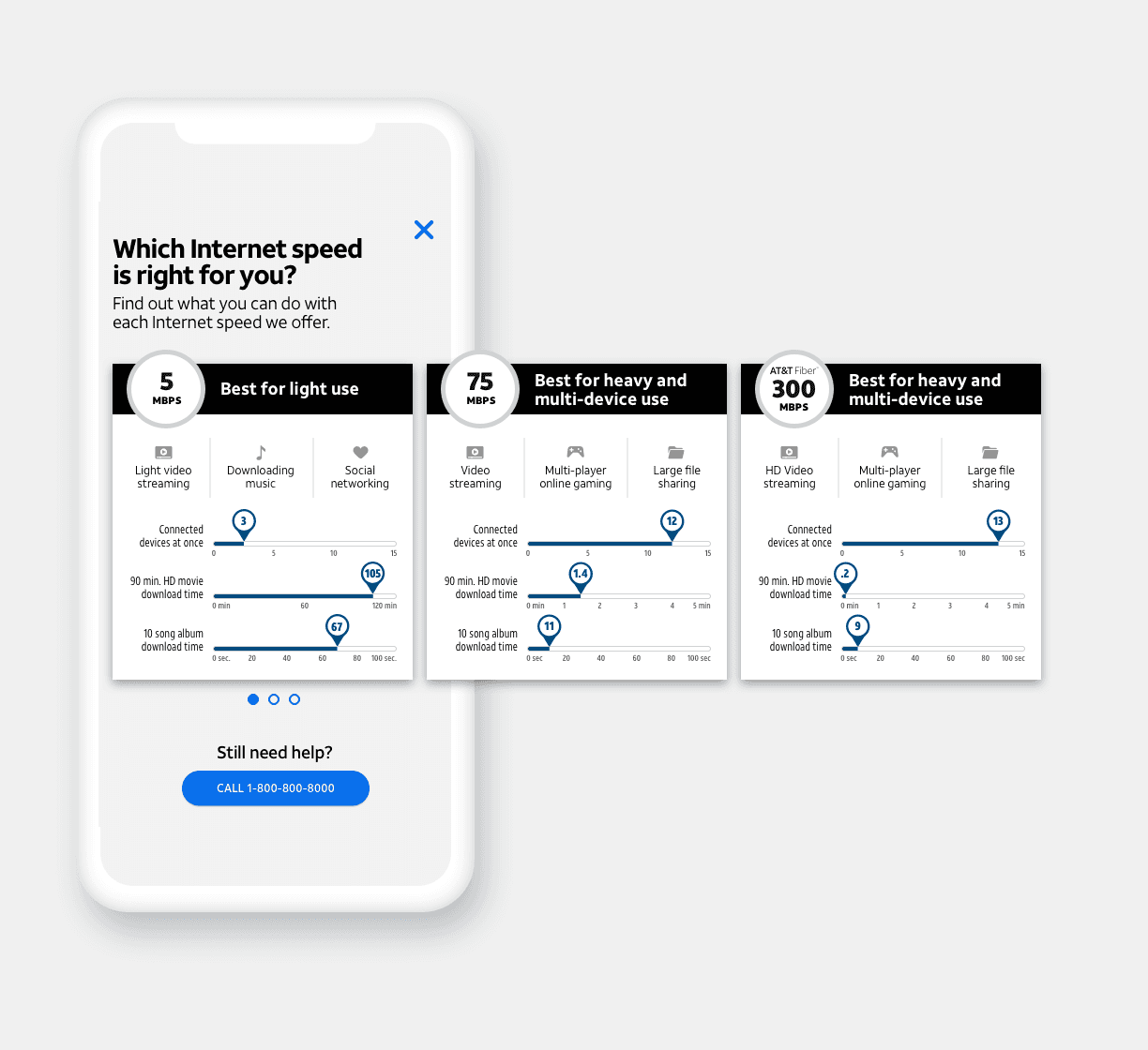
A major challenge in this project was creating a user experience that could adapt to multiple customer personas. AT&T’s services—like double play, triple play, and special promotions—are geo-specific, meaning users needed to be in certain locations to access specific offers and pricing.
This added a layer of complexity to the flow. Our team was tasked with identifying which services were available in different regions and customizing the experience dynamically based on the user’s location. Through close collaboration with development and business teams, we built a smarter, more personalized experience that helped users quickly find the right services without unnecessary friction.
A seamless experience turns complexity into confidence, guiding users effortlessly from discovery to checkout.
MY ROLE
Lead UX/UI designer
TEAM
4 Designers, 12 Developers, 2 UX writers, 1 Project Manager
DONE WITH
Sketch, Illustrator, ChatGPT, Relume, Lovable, Maze
INDUSTRY
FinTech

User Flow
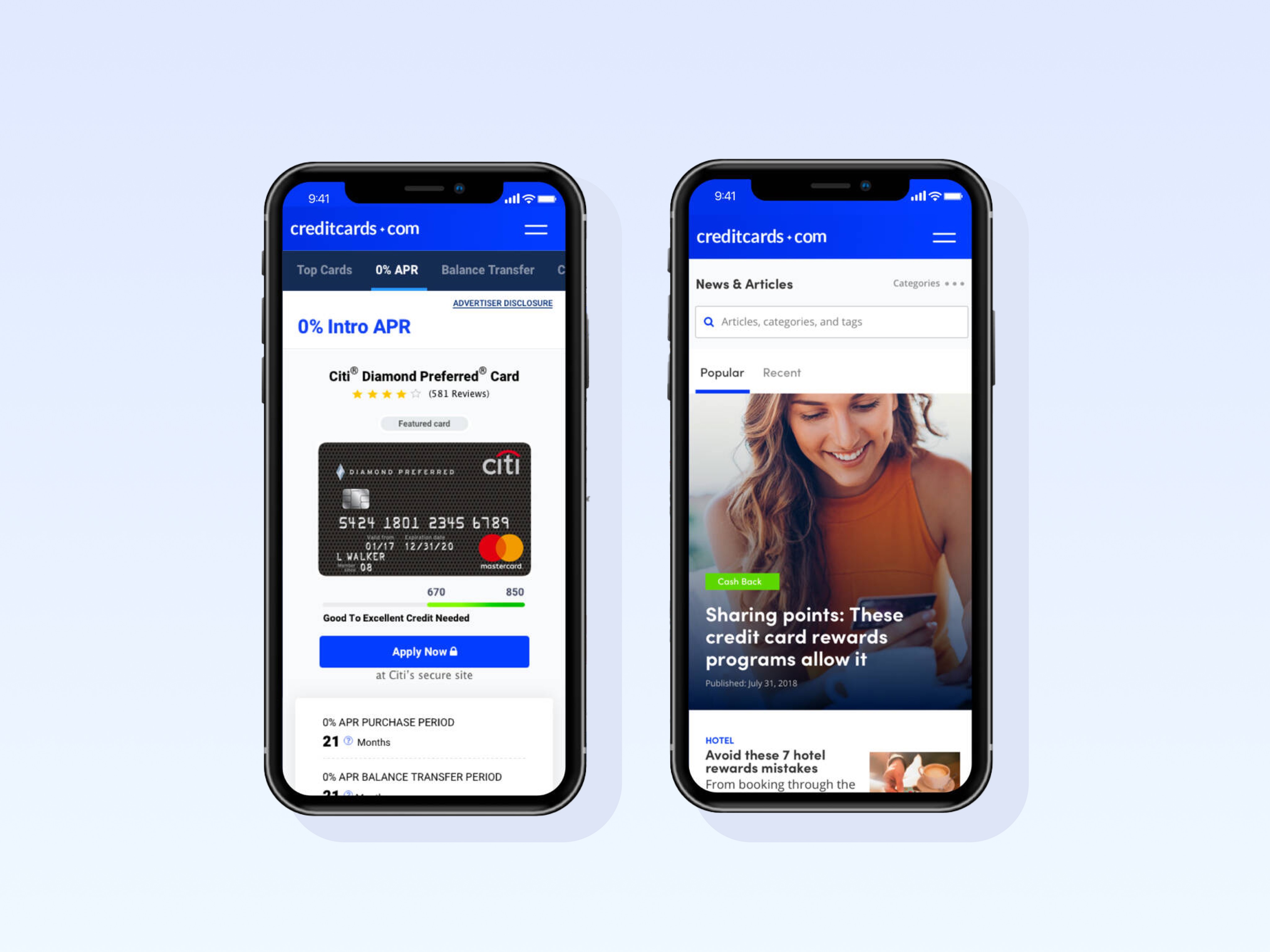
Analytics revealed that 60% of our audience entered the site through the Plans page, while only 30% came through the Home page. This insight made it clear that users often bypass the traditional homepage journey and jump directly into shopping or comparing plans.
With this in mind, our strategy focused on identifying both the user's location and their intent as early as possible, regardless of their entry point. By surfacing location-based personalization and tailoring the experience to the user's needs upfront, we could streamline their journey, reduce friction, and guide them more efficiently toward the right services and offers. This early funnel optimization became a key driver for improving both engagement and conversion rates.

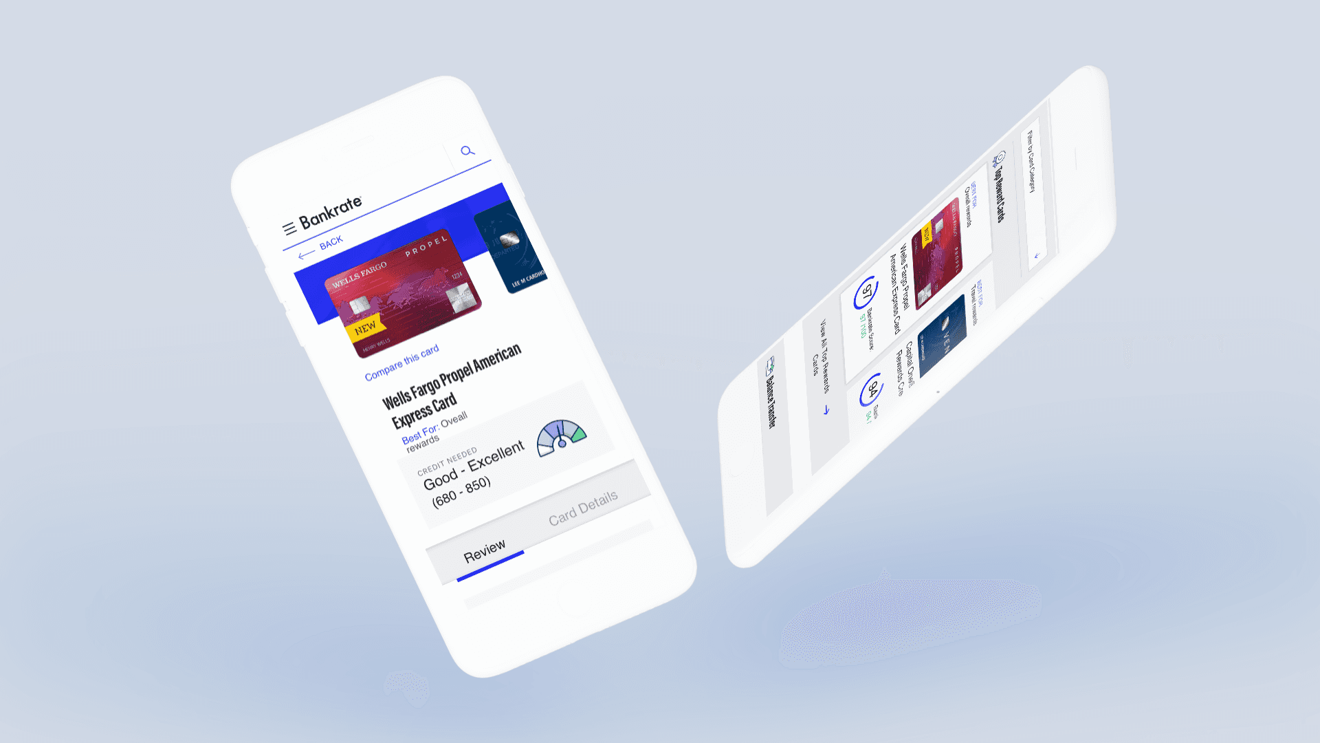
Visual
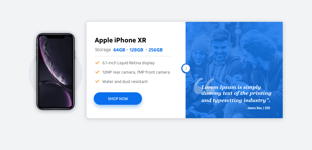
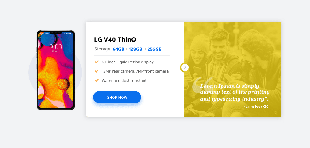
Leveraging AT&T’s established design guidelines and pattern libraries, we set out to craft user-centered experiences that felt both familiar and refreshing. Our focus was on simplicity, clarity, and effective communication—ensuring that every interaction was intuitive and purposeful.
Through thoughtful UX decisions and clean, modern visual execution, we streamlined complex flows, reduced cognitive load, and made it easier for users to navigate, compare, and act with confidence. Every design choice was made to align with AT&T’s brand principles while elevating the overall user experience to feel more seamless, accessible, and engaging across devices.


Results
The redesigned experience made it easier for users to find the right plans and devices based on their needs and location. By identifying users early in the funnel and personalizing the experience, we reduced user drop-off rates and increased plan exploration and cart engagement. Improved page structure, simplified flows, and cleaner communication helped create a more confident, frictionless shopping journey across the site.
OTHER WORK


Claim Your Free 3 Months
Get 3 free months of Framer Pro Yearly Subscription when upgrading your plan with the code partner25proyearly
Sign Up Now